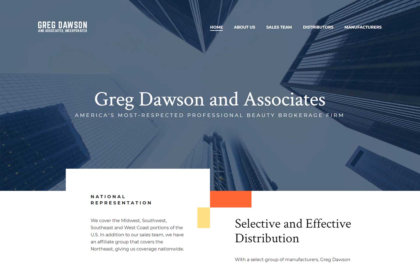
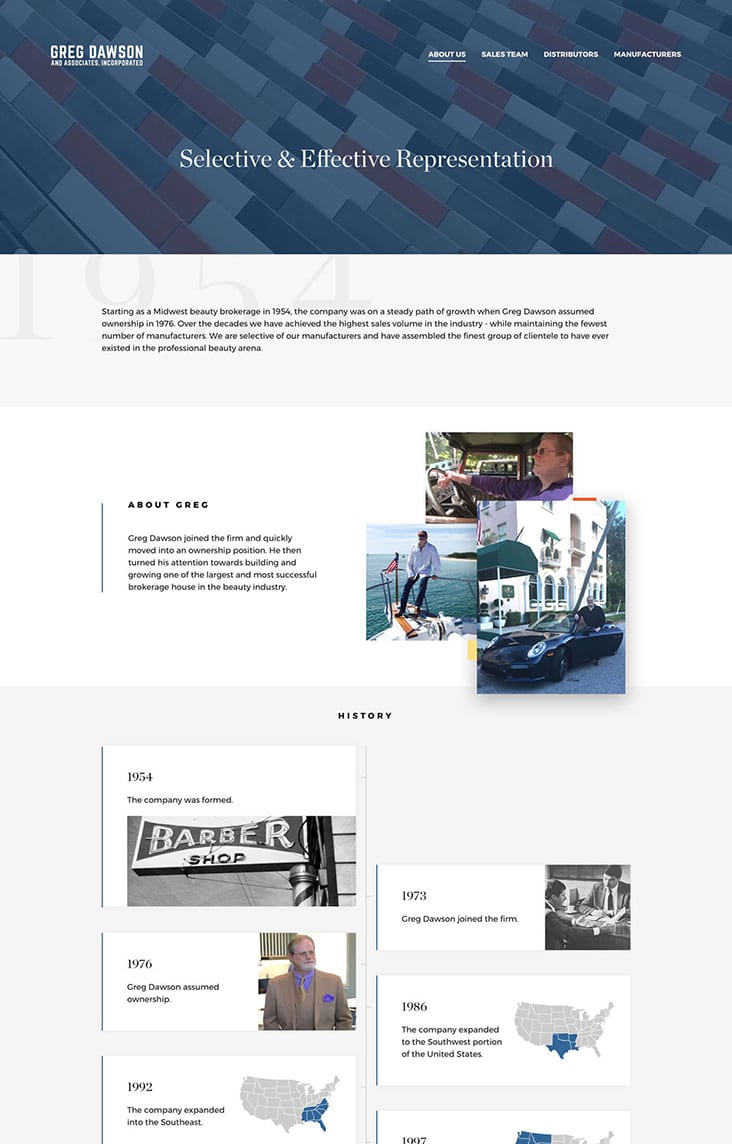
Beauty brokerage website redesign
Redesign and improved landing page relevancy decreases bounce rate

Logo design refresh
Before the refresh, the former wordmark for Greg Dawson and Associates was used inconsistently. Set in an outdated typeface and treated with a distracting shadow, the old wordmark warranted a modern, clean update. TBH Creative reworked the logotype by building on the solid, sturdy feel of the original. The new text-only treatment really stands out. The workmark was designed using a chic, sans serif typeface in set in two complementary sizes. This pairing creates a simple yet effective synergy and increases readability.
Related projects
Website redesign and digital marketing efforts grow sales pipeline
An upgraded look to match new business initiatives
Target audience needs driven website redesign