Button states in web design: 7 things to check before signing off on your new site’s look
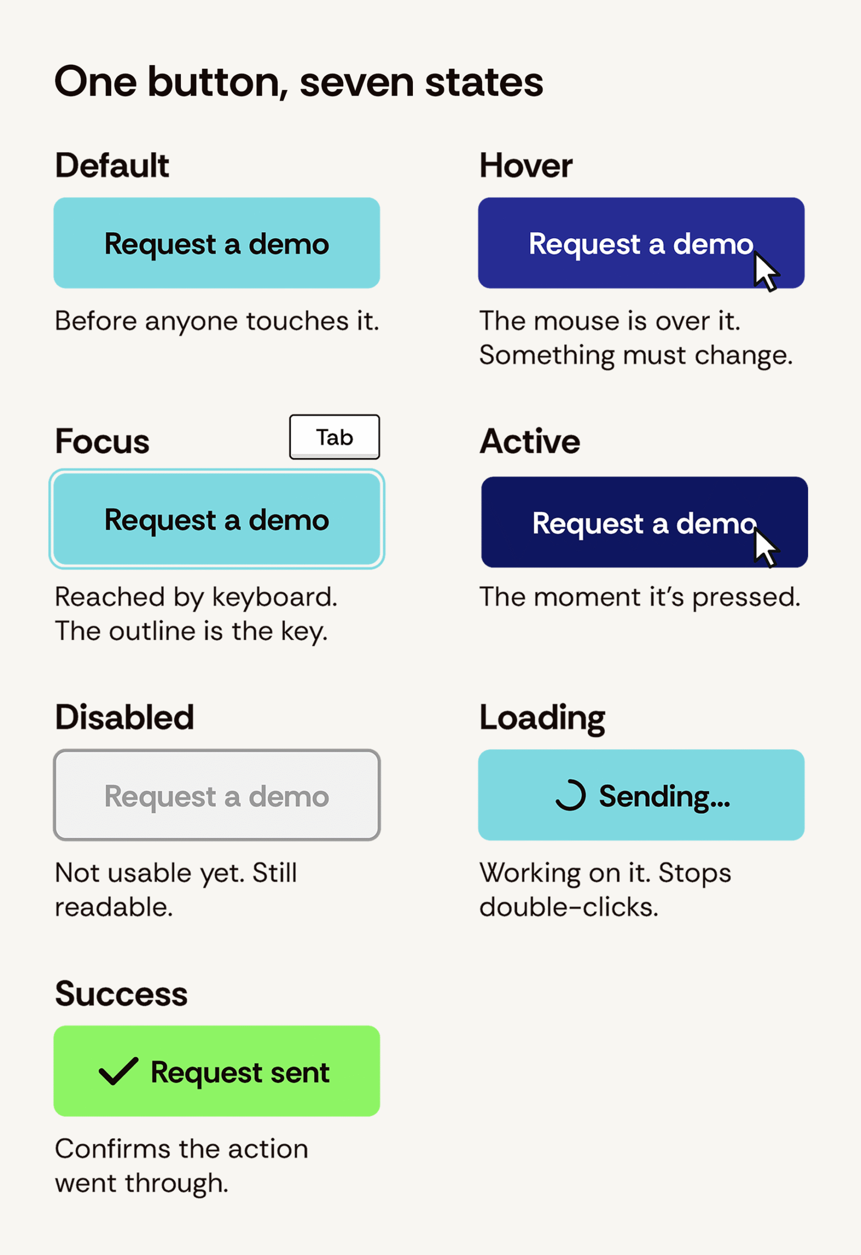
Almost everything you want a user to do when they come to your website involves buttons. And, when they’re designed well, you probably don’t think twice about what they look like when you click. They seem like simple elements, but there are a lot of pieces—each designed with a purpose—that have to work together to achieve that invisibility. There’s the version at rest, the version when a mouse hovers over it, the version a keyboard user lands on when they press Tab, the pressed version, and the gray one that means “not yet.” And, all of those versions are called button states in web design.
During most redesigns, you’ll see the default appearance when checking out high-fidelity design mockups since often how the rest look will get decided later. But it’s these other versions where potential accessibility and usability problems can creep in because they have to be invented on the fly during development, and this creation process can sometimes go forward without another critical review baked in.
In this post, you’ll find seven things to keep in mind to avoid button state issues on your new website—plus, check out visual examples of what good and not-so-good look like. No coding knowledge required.
What to look for in every button state before approval
Here are the seven different checks to complete when reviewing a new site’s button state designs, presented in the order in which they are typically reviewed.
Buttons should look like buttons, and links should look like links
This might sound a little obvious, but how some web designers create layouts is sometimes making the differences between these elements less clear:
- A button is meant to actually do something (e.g., submits a form, open a window, open a window, start a download, etc.).
- A link should take you somewhere else.
Website users have been trained for decades to understand that a filled shape means “hey, you should press me” and that a snippet of underlined text means “hey, click this to go over here.” When a site’s design solution blurs these two, it creates friction, making people hesitate or click the wrong thing.
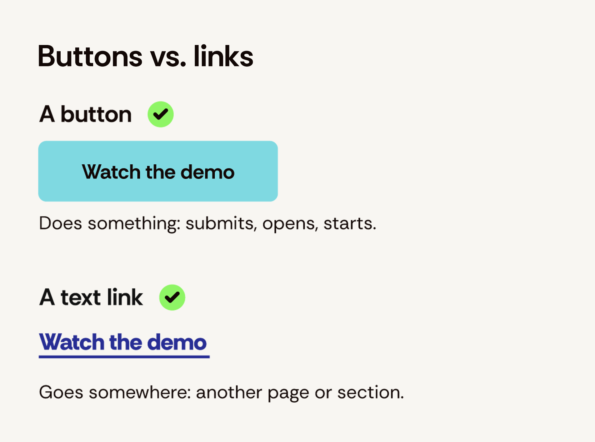
Look at any page of the design and ask whether you could point to every clickable thing without hovering over it. If the answer involves the word “probably,” the design needs work.
Here are the seven different checks to complete when reviewing a new site’s button state designs, presented in the order in which they are typically reviewed.
Every button state should be designed
Ask your agency partner or in-house web design team to show you the full set of states for your new site’s primary button element. At a minimum, those versions should include its default, hover, focus, active, and disabled states. For any button that will be used to submit a form or process a payment, add loading and success.
This shouldn’t be a big ask requiring extra work if it’s planned for from the get-go. Most of today’s best design tools, like Figma, make it easy to build all of these as variants of one component.
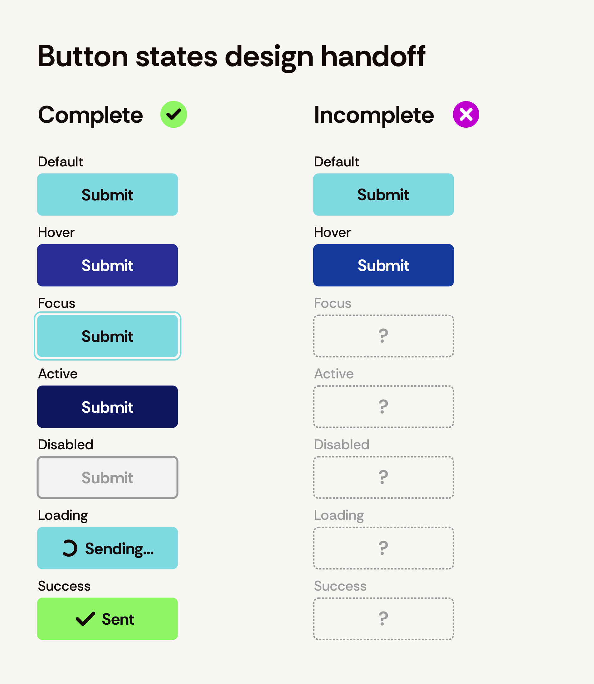
If these additional button states for web design aren’t delivered upfront, the missing versions can end up being an off-the-cuff decision forced onto your front-end developer. And, not every developer will make calls that are the best for your site’s accessibility if it’s not their area of expertise.
The focus state should be obvious
Sometimes users will navigate your website using a keyboard instead of a mouse (that is, by pressing Tab to move through a page’s outline and go from one clickable element to the next).
That outline is the focus state, and it’s how users who navigate without use a mouse know where they are on a webpage. WCAG 2.2, the accessibility standard audits reference now, requires focus indicators to meet minimum size and contrast rules. To avoid issues, design the focus state as part of the overall presentation of different button states to ensure it looks intentional instead of accidental.
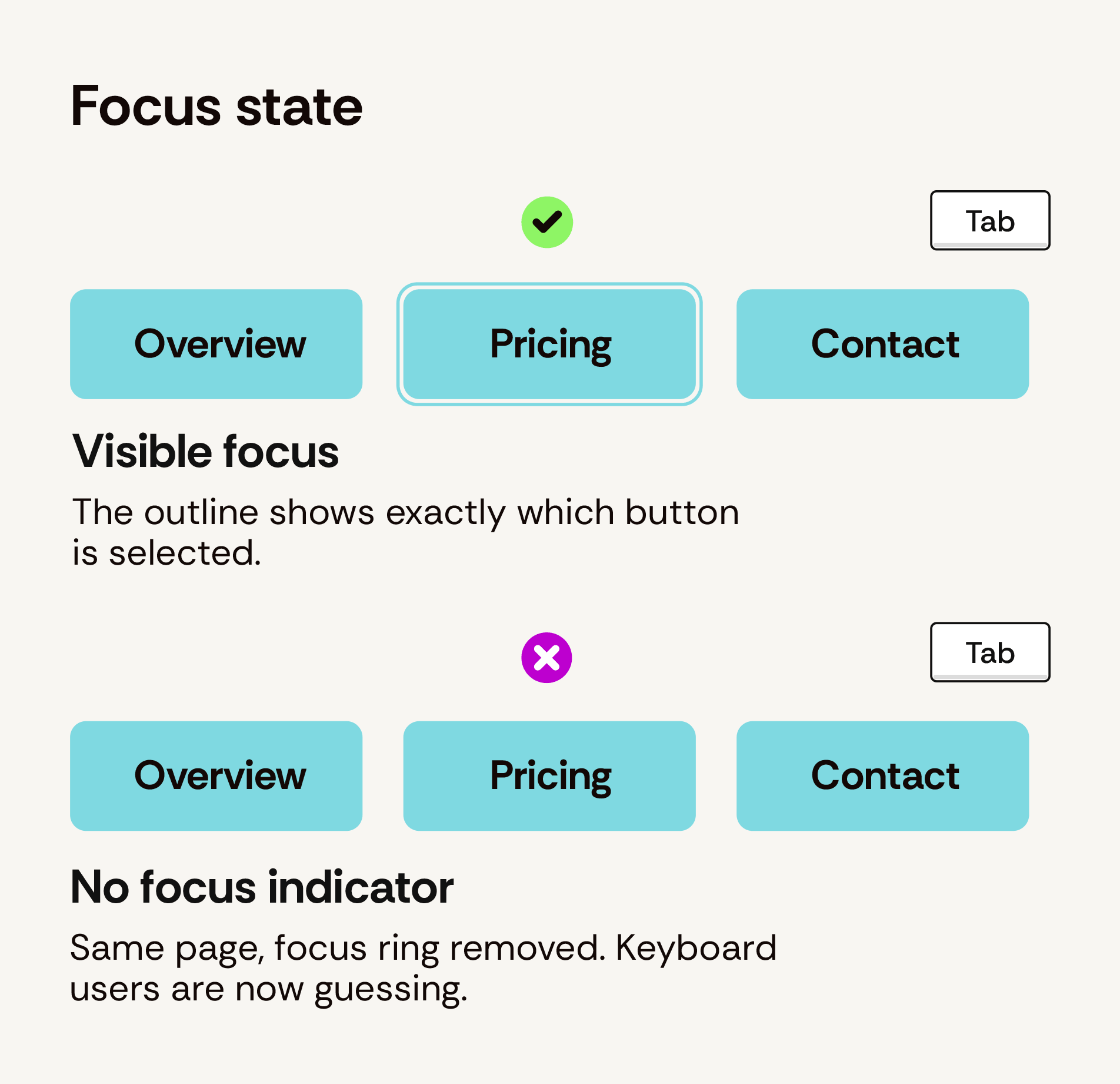
no idea which button they’re about to activate.
During the high-fidelity design review process, ask to see the focus state next to the hover state. If they’re identical, users won’t get a visual cue about which input triggered what so this is an immediate stop-the-review moment.
There should only be one primary button per section
A webpage can have multiple buttons. This won’t be an issue, if the design is handled with care. Things go wrong when all of the buttons on a page all look the same because they cancel each other out, causing your users to have to stop and read all of their labels to figure out where to go. Not helpful!
Most systems solve this sort of button conundrum by thinking through the webpage design and considering these three levels for button presentation:
- a filled primary button for the main action,
- an outlined secondary button for the alternative, and
- a plain text link for anything minor.
When reviewing a webpage’s high fidelity mockup, cover the text and look only at the buttons. It should be clear which is the most important one on the page because it should stand out immediately.
Buttons should be big enough for a click from a thumb
With most web traffic coming from mobile users on phones these days, make sure you’ve designed your buttons for this type of use because, after all, thumbs are much less precise than a mouse pointers.
WCAG 2.2 sets the floor at 24 by 24 pixels for anything clickable, but that’s a minimum for passing an audit, not designing a button’s target area. The number most platform guidelines land on is 44 to 48 pixels, as this approximately matches the width of most adults’ fingertips.
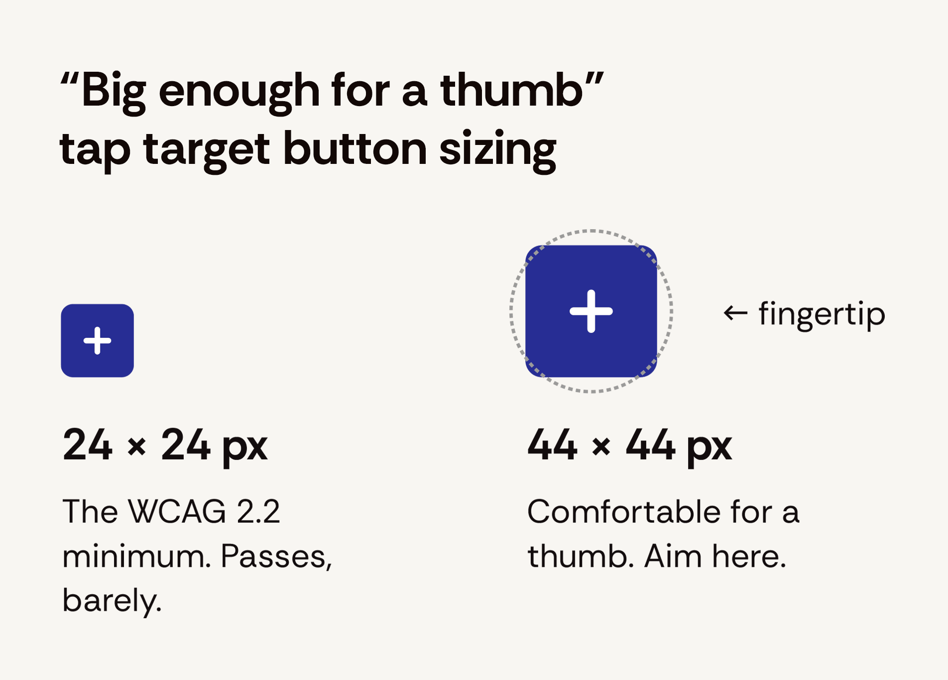
Proportional difference between 24-pixel minimum and the 44-pixel comfortable tap target button sizes.
But right-sizing alone won’t solve button usability issues on mobile. Don’t forget to also pay attention to spacing as it matters as much as size.
Two buttons crammed together on a phone screen are an invitation to tap the wrong one, and when one of them is “Delete,” that’s a support ticket waiting to happen.
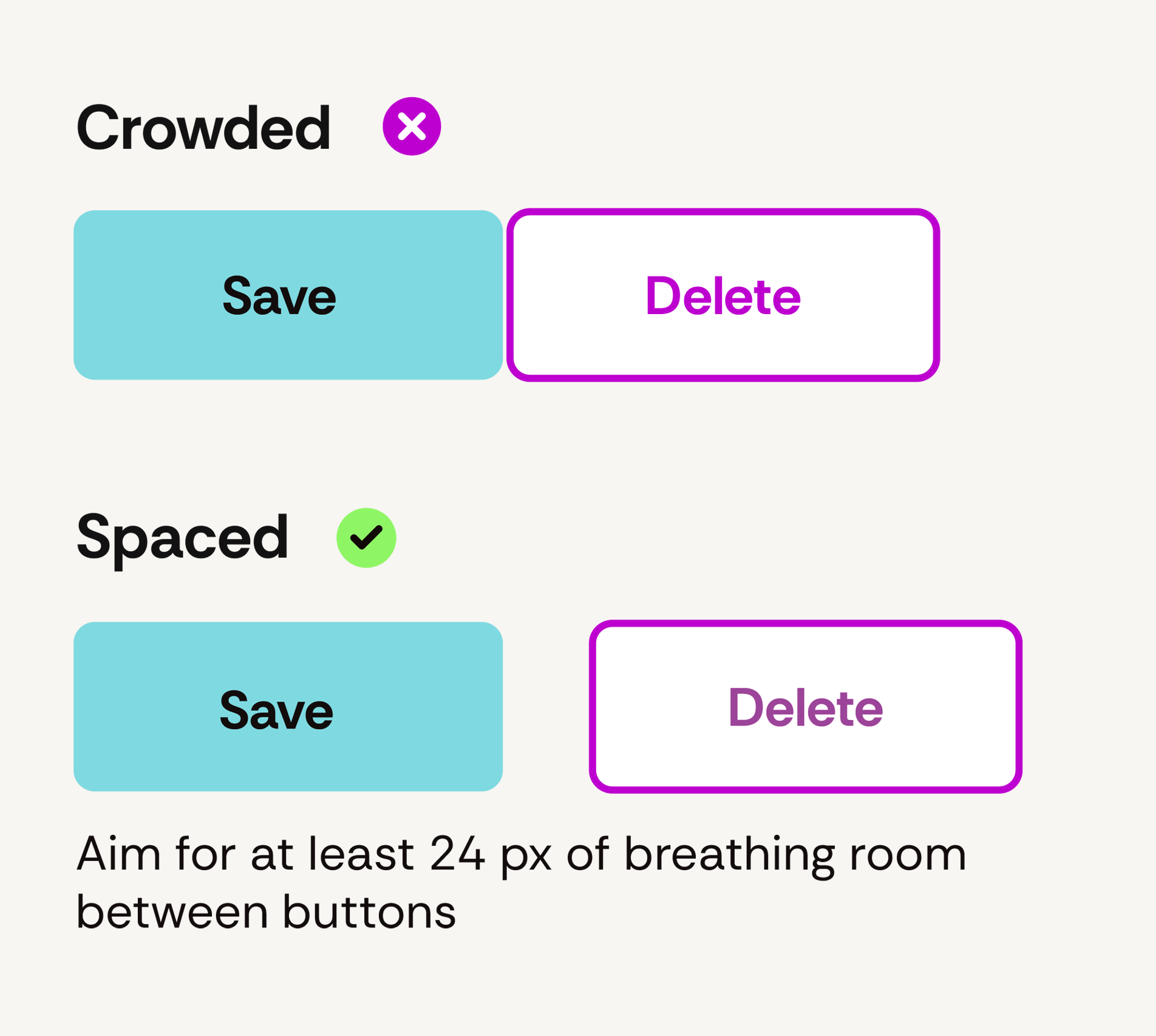
The same two button pairs shown crowded and spaced apart to allow easier tapping without error.
Labels should be specific and tell users what will happen if they click
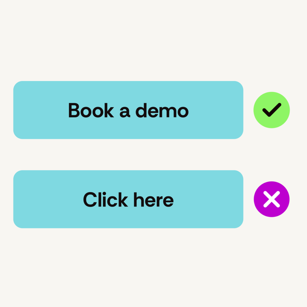
A button label is a promise about what happens next, and “Submit,” “OK,” and “Click here” don’t
promise anything. Labels that start with a verb and name the outcome (“Request a demo,”
“Download the guide”) get more clicks and fewer surprises. For anything that can’t be undone, the label should be specific (e.g., “Delete 3 files” is a safer choice for a label than the otherwise vague “Confirm”).
Button labels can also a serious accessibility issue. Screen reader users often jump through a webpage by pulling up a list of its buttons and links, out of context. A list of button labels that reads “Submit, Submit, Learn more, Click here” is going to be pretty much useless for all of those screen reader users.
Your disabled and loading states should be honest
A grayed-out button with no explanation is a dead end, and no one likes a dead end on a website. It’s just about as annoying as when a website bounces you between pages in an endless circle as part of a wonky redirect loop.
When users see a disabled button without any helper text, they end up wondering what the heck they did wrong. If a button has to be disabled until a form is filled in, the design should say so right next to it. Alternatively, consider skipping the disabled state all-together and instead let the button explain the problem when it’s pressed with specific helper text.
Alternatively, for loading states, make sure that when a visitor clicks that something happens if there’s going to be some processing and wait time expected. If nothing visibly changes upon click, users tend to want to click again—and, as we all know, this can cause issues like the submission of duplicate entry forms or two charges on a card, etc.
There’s a simple solution. Include a button state with a message like “Sending …” to help prevent annoying problems (and creates a better user experience).
Extra credit when it comes to button states in web design
Here are two more simple checks to complete during the website design process that often get overlooked but shouldn’t:
- Dark mode: A growing share of phones and laptops flip to a dark color scheme in the evening, and a website can follow that setting automatically. A dark-blue button that looks great on a crisp white background can nearly vanish against a site when it has a dark backdrop. During the high-fidelity review process, ask your agency partner or in-house web design team whether their designs account for both modes (or if, at a minimum, they plan to build the site so that it stays light on purpose even if users’ systems are set for dark mode).
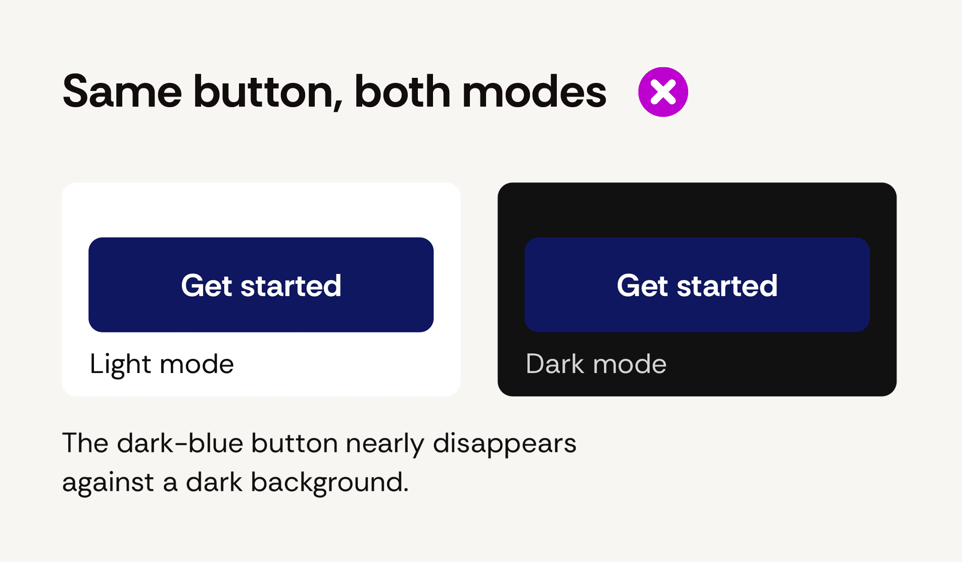
The same button in light and dark mode, using one color for both.
- Contrast: The text on a button needs a contrast ratio of at least 4.5:1 against the button’s fill, and the button itself needs at least 3:1 against whatever is behind it. Those two numbers cover most of the color-related accessibility failures we see, and any web designer can check them with a free tool in about ten seconds.
Planning an enterprise website redesign?
Button states in web design are one small piece of a much bigger project, and they’re a good indicator of how carefully the rest of it will be handled. An experienced web design agency that thinks about every button state before development starts is a team that’s thinking about real users’ needs and your business goals (not just what will look cool in their portfolio).
TBH Creative has been designing and building accessible websites for companies and organizations across a wide range of industries since 2004. If you’re preparing for a complex website redesign project and want a partner who sweats the details, let’s talk.

About the author Tatum Hindman
Tatum is the president of TBH Creative and is responsible for building long-term client relationships. She enjoys the strategy behind web design and collaborating with clients to define and execute online marketing goals. She likes to blog about hot topics in web design and digital marketing, as well as share tips for strengthening your online presence.