Responsive email design: Examples and resources
Mobile email use has been steadily increasing over the years. According to recent email statistics, mobile users account for almost half of email opens. However, many email campaigns are still not formatted to display properly on mobile devices.
One way to maximize accessibility across a variety of devices and email clients is to make the switch to responsive email design. We’ve previously discussed the fundamentals of responsive email design, and now we’re going to take a closer look at some examples and helpful resources to help further optimize your emails for mobile devices.
 Team Treehouse uses a brief headline and introduction that’s right to the point.
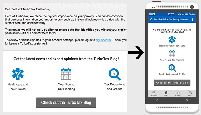 TurboTax links to important content with an icon and short headline, which fits within the entire screen on mobile.
 Maurice increases the size of the sale details text on smaller devices to make it easier to read.
 EdX uses large CTA buttons that are easy to click on small screens.
 Adobe’s Creative Cloud emails are in a one column format, which adapts easily to smaller screens.
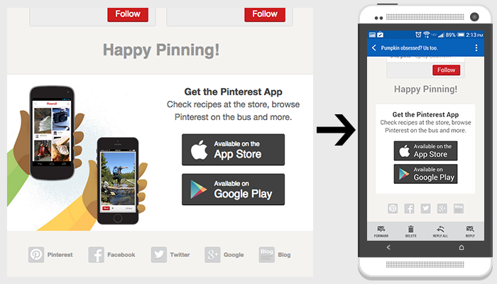 Pinterest hides non-crucial content to better adapt content to smaller screens.
One way to maximize accessibility across a variety of devices and email clients is to make the switch to responsive email design. We’ve previously discussed the fundamentals of responsive email design, and now we’re going to take a closer look at some examples and helpful resources to help further optimize your emails for mobile devices.
Examples of best practices
Make your message clear and concise. On mobile devices, you have a very limited amount of space to capture the reader’s attention.
Minimize content. Include only the most important information so that it more easily adapts to small screens with less scrolling required.
Pay special attention to text size for those smaller screens. Make sure all content is large enough to read on mobile devices.
Create call-to-actions large enough to easily click for smaller screens.
Use one-column layouts to ensure your content is easily read on mobile.
Hide unnecessary content for smaller screens.
Tools and resources
- Litmus, a tool for testing emails on all devices and email clients
- Responsive Email Design Guide by Campaign Monitor
- Responsive Email Reference by MailChimp
- Responsive email templates by Antwort
Need help with your email marketing strategy?
TBH Creative offers a variety of mobile and email marketing services, including responsive email design. We can help optimize your email campaigns to reach a wider audience and generate results. Contact us today to get started!
This post was written November 20, 2014.

About the author Kayleigh Circle
Kayleigh is a web developer at TBH Creative, specializing in front-end development. She likes to blog about a variety of web design topics, including design tips, the latest trends in the industry, and how to make your website more successful.

