How to create a squeeze page that converts: A 2026 playbook for marketing leaders
Most guides on how to create a squeeze page that converts cover only the basics most folks already know (e.g., write a catchy headline, keep the form short, and remove your navigation). That’s fine if you’re new to marketing, but if you’re trying to figure out why your current opt-in pages aren’t getting results (or if you want a refresher before launching a new campaign on what it takes to maximize conversions in 2026), this post is for you.
These days, those basics aren’t enough. You need to also consider how people interact with landing pages, especially since factors like AI-driven personalization, tight privacy regulations, and generative search have changed what a “high-converting” squeeze page looks like.
Keep reading to learn what it takes to create a modern lead capture page with the potential to convert at 20% or more. Plus, find out what to test if your numbers plateau and get tips for structuring your pages to ensure they’ll perform well organically in search results, as well as AI Overviews, Perplexity citations, and other generative engine outputs.
Why squeeze pages still matter in 2026
A squeeze page is a single-purpose web page designed to capture a visitor’s contact information (almost always an email address) in exchange for something valuable. Unlike a landing page that might ask someone to buy, book a demo, or explore features, a squeeze page does one thing: collect that contact information through an opt-in form.
If your current page includes navigation links, footer menus, or secondary calls to action, it’s functioning as a landing page with an email form, not a squeeze page. That distinction matters because well-built squeeze pages convert at 12% to 27% (SeedProd), significantly higher than the 2% to 5% most general landing pages achieve.
Squeeze pages earn their place in 2026 because they produce the cleanest attribution data (one form, one CTA, no ambiguity), force strategic clarity about your offer, scale well with paid media through message match, and feed segmented nurture sequences by pre-qualifying leads based on interest.
The anatomy of a high-converting squeeze page
Every squeeze page that converts well shares the same structural DNA.
Headline and subheadline
Your headline is the reason someone stops scrolling. The strongest ones tell visitors what they’ll be able to do or know after opting in. “Download Our Email Marketing Playbook” is weak. “The Email Sequences That Generated $2.4M in Pipeline Last Quarter” is specific and outcome-driven.
The subheadline adds the who and the how. Example: “A 12-page tactical breakdown for B2B marketing teams running campaigns over $50K/month.” The right people lean in; the wrong people self-select out.
Copy, form, and CTA
Three to five bullet points describing specific takeaways are usually the right amount of body copy. Each bullet should name a concrete outcome, not a vague topic.
Keep the form short. A single-email field converts at a significantly higher rate than multi-field forms. If your sales team needs a qualifying data point, add one field, but test whether the trade-off kills your opt-in rate.
For the CTA, ditch “Submit.” Use first-person, benefit-oriented language: “Send Me the Playbook,” “Get My Free Checklist,” “Show Me the Data.” Make the button the most visually prominent element on the page.
Social proof and layout
“Join 10,000+ subscribers” is good. “Used by marketing teams at Salesforce, HubSpot, and Drift” is better. Choose testimonials that speak to the quality of the resource, not just general satisfaction.
For inspiration on social proof execution, look at Opensend’s demo request landing page (opensend.com/book-a-demo). It’s not a squeeze page, but its animated treatment of real customer quotes is worth studying. The page weaves dozens of results-driven testimonials directly into the scroll experience. That technique works on any conversion page.
For layout, strip everything that isn’t essential: no navigation, no footer links, no sidebar widgets, no secondary CTAs. Let brand consistency come through color, typography, and voice, not chrome.
Squeeze page examples worth studying
Here are five patterns that represent different approaches, industries, and offer types. I’ve also included two common lookalikes that might be undermining your conversion rates.
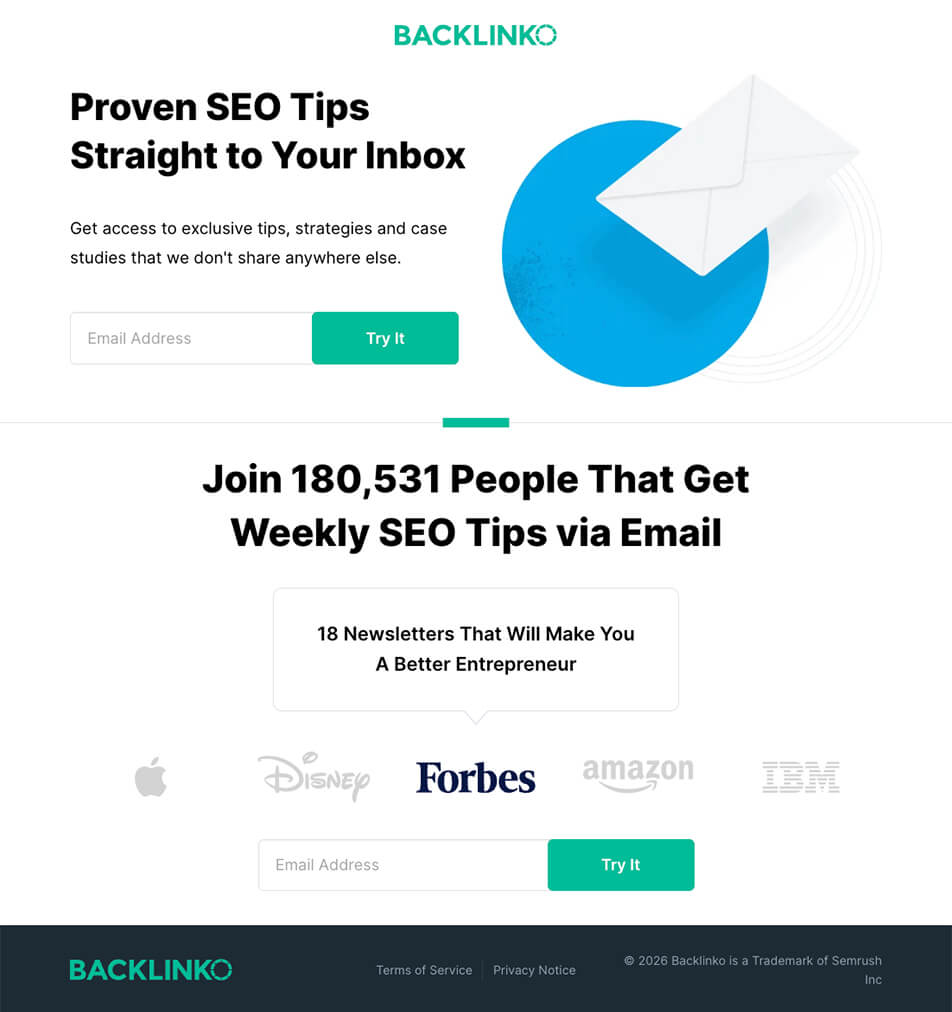
Social-proof-heavy example: Backlinko
Backlinko’s newsletter signup displays its subscriber count (180,000+) and brand logos from Apple, Disney, Forbes, Amazon, and IBM. No navigation, single email field, two opt-in forms. Best for competitive markets where your social proof is genuinely impressive.
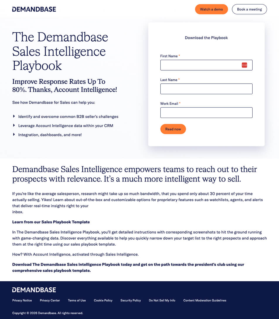
Resource-preview for paid search example: Demandbase
Demandbase’s Sales Intelligence Playbook page (demandbase.com) promises “detailed instructions with corresponding screenshots” to help sales teams prioritize prospects. That specificity in the description is what separates high-converting opt-in pages from vague ones. Best for high-value content offers where the quality is the selling point.
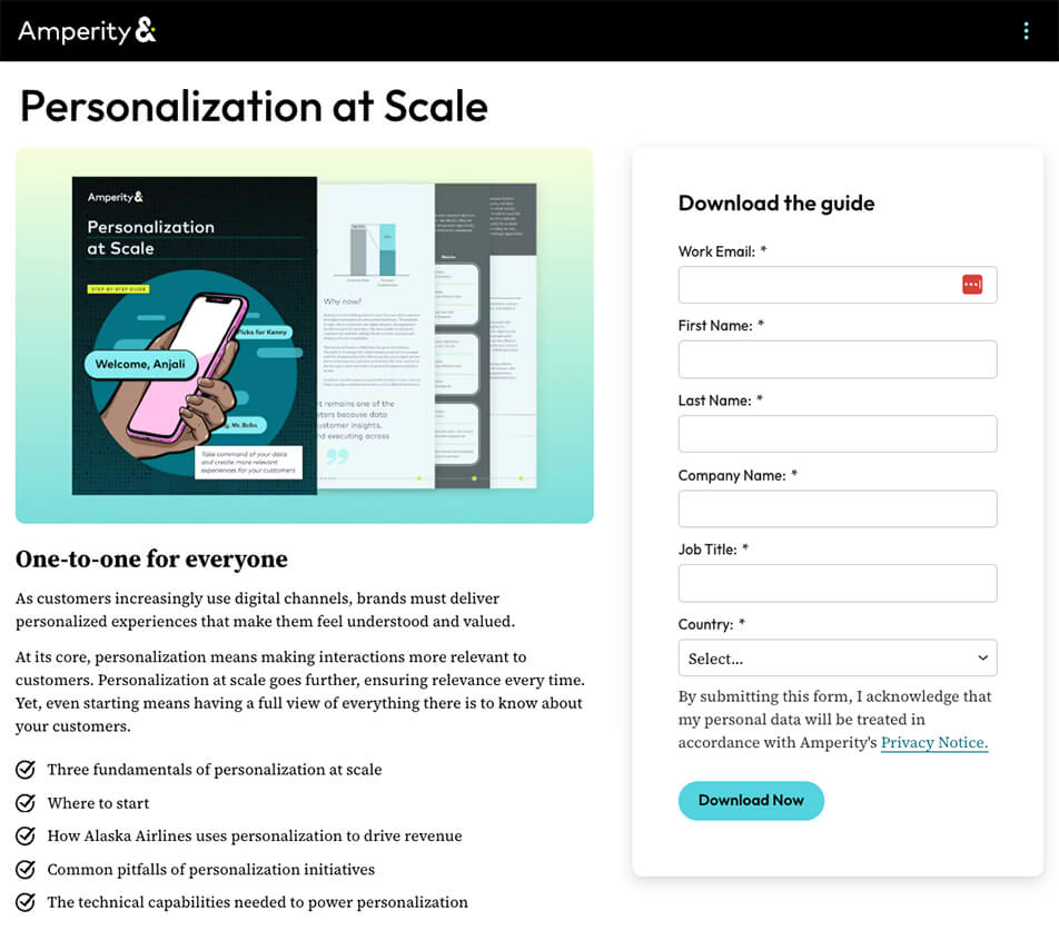
Resource-preview with multi-field form example: Amperity
Amperity’s personalization guide (amperity.com) is gated behind a multi-field form (likely name, email, company, title). This is common for enterprise B2B, where lead qualification matters more than raw volume. Worth studying for the trade-off between form length and data quality.
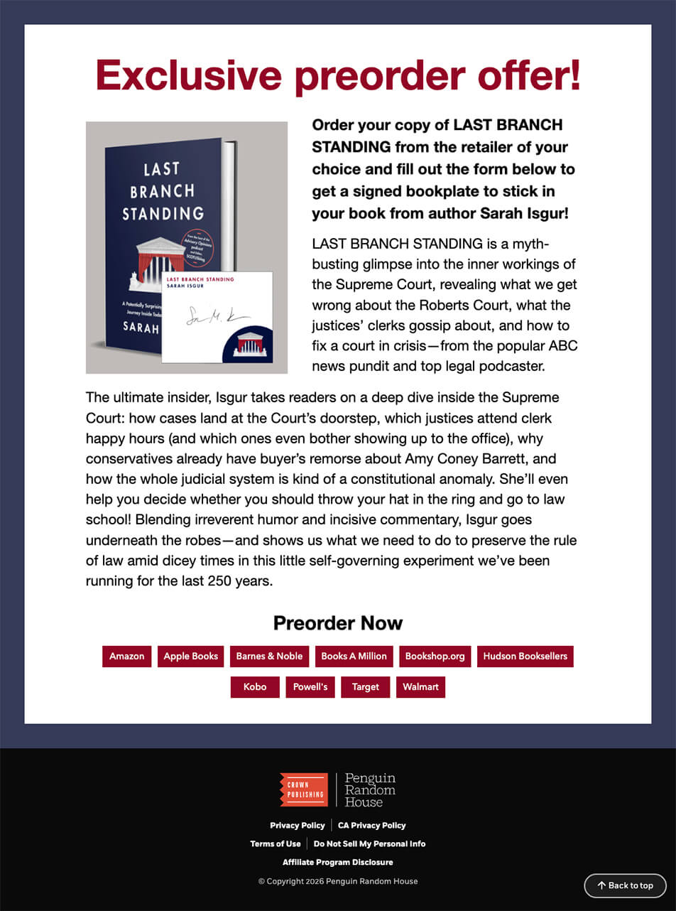
Minimalist free-item page example: Penguin Random House
This Penguin Random House page (sites.prh.com) offers a free signed bookplate in exchange for contact information, including a mailing address. The offer is tangible and personalized, which makes the exchange feel generous rather than transactional. When your offer genuinely requires additional information to deliver, asking for it doesn’t feel like friction.
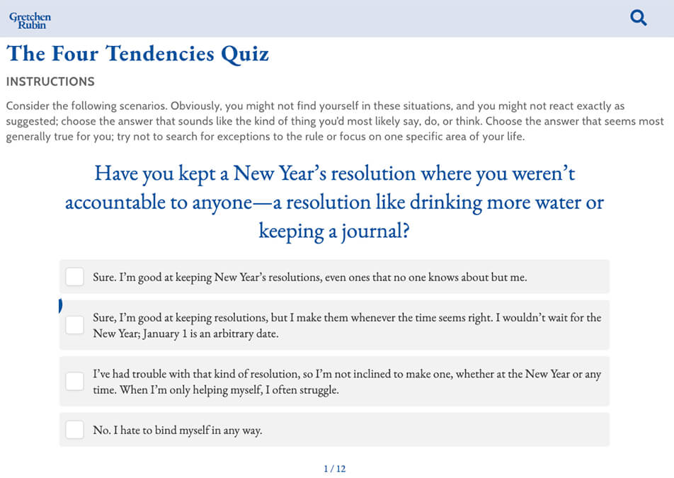
Segmented opt-in example: Four Tendencies Quiz
Gretchen Rubin’s Four Tendencies Quiz (gretchenrubin.com/quiz) requires an email to deliver detailed results. Over 3.5 million people have taken it. The quiz automatically segments each lead into one of four personality types, so the follow-up sequence can be personalized, starting with email one. Quiz-based lead magnets convert at roughly 30%-40% on average (Interact). Best when your nurture sequence benefits from segmentation data.
What a squeeze page isn’t: two common lookalikes
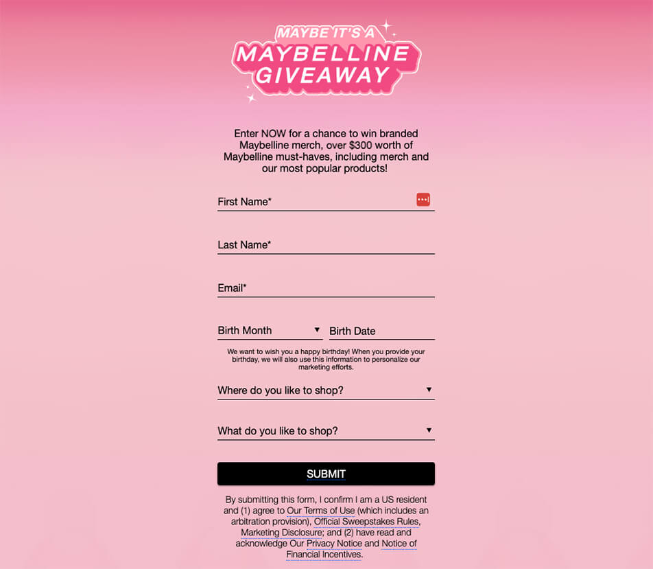
Promotions hub page
Maybelline’s promotions page, which collects email addresses via sweepstakes entries, is a multi-promotion hub with site navigation and competing CTAs. If your team has a page like this, you might see better conversion results by breaking each promotion into its own dedicated squeeze page.
Product download page
OpenAI’s Codex page (chatgpt.com/codex) features strong testimonials and clear CTAs, but the goal is to drive product adoption across multiple surfaces. A page where visitors evaluate features and compare plans is a fundamentally different conversion path than the one-action exchange of a squeeze page.
How to create a squeeze page that converts: the build process
Knowing what goes into a squeeze page and actually building one are different problems. Here’s the sequence that gets you from concept to a live, trackable page.
Start with the offer, not the page
Define what you’re giving away, who it’s for, and what specific problem it solves. If your team can’t describe the offer in one sentence that makes a busy director of marketing stop and pay attention, the page won’t save it. Get the offer right first. Everything else follows from that.
Choose your creation tool
Landing page builders like Unbounce, Leadpages, or Instapage let you launch fast without involving developers. Your CMS (WordPress, HubSpot, etc.) works if brand control matters more than speed. Custom development makes sense when you need deep integration with your CRM, analytics stack, or personalization engine. Pick based on how quickly you need to be live and how much flexibility you need after launch.
Write the copy before touching design
Headline, subheadline, three to five bullet points, CTA text. Write all of it in a doc before anyone opens a design tool. Copy drives the page structure, not the other way around. Brief your designer after the messaging is locked.
Build, connect, and launch
Design for one action with zero distractions. Connect your email platform and load the nurture sequence before launch (the first email should fire immediately on opt-in). Configure UTM parameters on every link pointing to the page and set up form submission as a key event in GA4. Then launch and plan your first A/B test within 30 days.
What’s new in squeeze pages in 2026
The structural fundamentals above haven’t changed, but the execution layer has. Here’s an overview of what’s new.
AI personalization and page speed
Static squeeze pages where every visitor sees the same headline are increasingly a missed opportunity. Platforms like Mutiny, Intellimize, and OptiMonk now let you dynamically adjust headlines, imagery, and CTAs based on traffic source, location, or behavior. Personalized CTAs outperform generic ones by roughly 202% (HubSpot).
Page speed is just as critical. Pages that load in one second convert at roughly 3x the rate of pages that take five seconds (Think with Google), and mobile devices now account for over 82% of landing page traffic (Backlinko). Test load times on a real phone over cellular, not Chrome DevTools on office Wi-Fi.
Mobile-first, privacy, and accessibility
Design for a 375px screen first, then scale up. Minimum 44×44 pixel tap targets (WCAG), 16px minimum body text, and a form that fits the viewport without horizontal scrolling.
Privacy regulations now extend well past GDPR (think CCPA/CPRA, CASL, and state-level US laws). Use clear consent language near the form, keep a visible link to the privacy policy, avoid pre-checked boxes, and capture timestamped consent records. A line like “We’ll send you the guide and occasional insights. Unsubscribe anytime.” can actually improve conversion rates.
On accessibility: an estimated 16% of the global population lives with some form of disability (WHO). At minimum, use visible form labels (not just placeholder text), meet 4.5:1 contrast ratios, support keyboard navigation, and announce error messages to screen readers.
Testing and measurement
Test in order of impact. Start with the offer itself (if you’re under 10%, the problem is what you’re offering, not how the page looks). Then test the headline and positioning, then the form structure and CTA, then the layout and design, and finally social proof.
For complex optimization, consider multivariate testing or AI-powered tools such as Optimizely and VWO, which dynamically allocate traffic to winning variants.
Metrics that matter
Track conversion rate by traffic source (to distinguish page problems from traffic problems), cost per lead by channel, lead-to-opportunity rate (to connect squeeze page performance to revenue), and bounce rate by device (to spot mobile friction).
As benchmarks, paid search tends to convert at 3%-8% on squeeze pages, warm email traffic at 15%-30%, and cold social traffic at 2%–6%. Tag every link with UTM parameters and set up event tracking on form submissions in GA4.
The post-click system
What happens after someone opts in matters just as much. Most thank-you pages say “Thanks! Check your inbox.” and nothing else. A better thank-you page presents a relevant next step (webinar registration, consultation booking), introduces a tripwire offer, or asks a segmentation question.
For the email sequence: deliver the promised resource immediately in email one. Emails two through five should provide related value and build the relationship before introducing a sales-oriented CTA. Treating the nurture sequence as a product pitch from email two breaks the implicit agreement and damages trust.
Structuring for GEO and AI search visibility
Generative Engine Optimization (structuring content to be cited by AI systems like Google’s AI Overviews and Perplexity) matters for the supporting content linking to your squeeze pages. Some tips:
- Structure each section as a standalone answer: lead with a direct one-to-two sentence response, then expand with detail.
- Apply Article and FAQPage schema markup.
- Build topical authority through content clusters.
- Keep everything up to date with current data and tactics.
6 problems that reduce squeeze page conversions
- Mistake #1: An overcomplicated form. Instead, collect extra data through progressive profiling, not on the squeeze page.
- Mistake #2: A weak offer. “Subscribe to our newsletter” isn’t usually a compelling offer. Make sure your lead magnet solves a specific, recognizable problem.
- Mistake #3: A messaging mismatch. If your ad promises a benchmarking report and the page headline says “Stay Ahead of the Curve,” you’ve introduced doubt.
- Mistake #4: A slow-loading page. Four seconds of load time can cost you roughly half as many potential conversions as a page that loads in one second can get.
- Mistake #5: There’s no exit-intent fallback. An exit-intent pop-up typically adds about 1% to conversion rates (Backlinko).
- Mistake #6: You forgot to test! If you’ve run the same page for 30+ days without testing a single element, you’re leaving conversions on the table.
Checklist: Refine your squeeze page before launch
- The offer solves a specific, recognizable problem for your target audience.
- The headline communicates a clear benefit in 10 words or fewer.
- The subheadline qualifies the audience and sets expectations.
- The form asks for only the information you genuinely need.
- The CTA uses first-person, benefit-oriented language.
- Social proof is specific and credible.
- All navigation, footer links, and secondary CTAs have been removed.
- The page loads in under two seconds on mobile.
- Consent language is clear and privacy-compliant.
- Form fields have visible labels and meet WCAG 2.1 AA contrast requirements.
- UTM parameters and event tracking are configured.
- The thank-you page includes a meaningful next step.
- The nurture email sequence delivers the resource immediately.
- You have at least one A/B test planned for the first 30 days.
Squeeze pages vs. landing pages: A quick rundown of differences
- A squeeze page has one goal: capture contact information. A landing page might ask visitors to buy, book a demo, or explore features.
- A squeeze page offers something specific in exchange for contact info (e.g., a guide, quiz results, a discount code). A landing page often presents the product itself as the reason to act.
- A squeeze page strips away all navigation and secondary links. A landing page often retains site navigation or multiple CTAs.
- A squeeze page typically uses one or two form fields. A landing page may include longer forms, plan selectors, or multi-step flows.
- A well-optimized squeeze page converts at 12%-27% (SeedProd), whereas the median landing page conversion rate is 6.6% across all industries (Unbounce).
Ready to create a squeeze page that converts?
If you’ve made it this far, you have everything you need to build, diagnose, or optimize a squeeze page for 2026. The fundamental must-haves remain the same as before (strong offer, clean design, minimal friction), but the bar for execution has changed—from AI personalization, page speed, and mobile-first design to privacy compliance and accessibility.
If you’re not getting the conversions you expected, TBH Creative’s squeeze page experts can help. We’ve helped marketing teams across a wide range of industries identify what’s off and implement fixes that amplify conversion results. How can we help you? Let’s talk.

About the author Joy Olivia Miller
Joy is the creative director at TBH Creative and uses her expertise to help clients use their online communications to build, design, and manage their brands. She likes to blog about content marketing in all its forms, the latest trends in digital marketing, and share tools with readers.