14 elevated family office websites & private equity web design solutions
Related
Securing good funding opportunities continues to involve considerable uncertainty and challenges, according to the latest reports from Citi, Preqin, and UBS.
Although staying the course is the path many are taking, the savviest are using this uncertain time to invest in building a stronger foundation to attract better partnership prospects—despite the limited supply of high-quality deals available—with enhanced online investment marketing. Why? Because impressions matter (and so much initial vetting and trust-building takes place digitally). If you’re among those thinking ahead and prioritizing family office websites and private equity web design and development projects, this post is for you.
So, where do you start? What exactly does it take to launch and manage a family office or private equity site that will consistently meet top users’ needs while supporting your strategic business and marketing goals?
There’s a long list of universal qualities associated with elite websites. You can get those must-haves for being “set up for success” just about anywhere. Instead of rehashing those basics, this round-up takes a deeper dive into what you really need to know. It covers the top six elements underpinning the best financial investment-focused sites, helping them convert more often and generate the most significant website ROI.
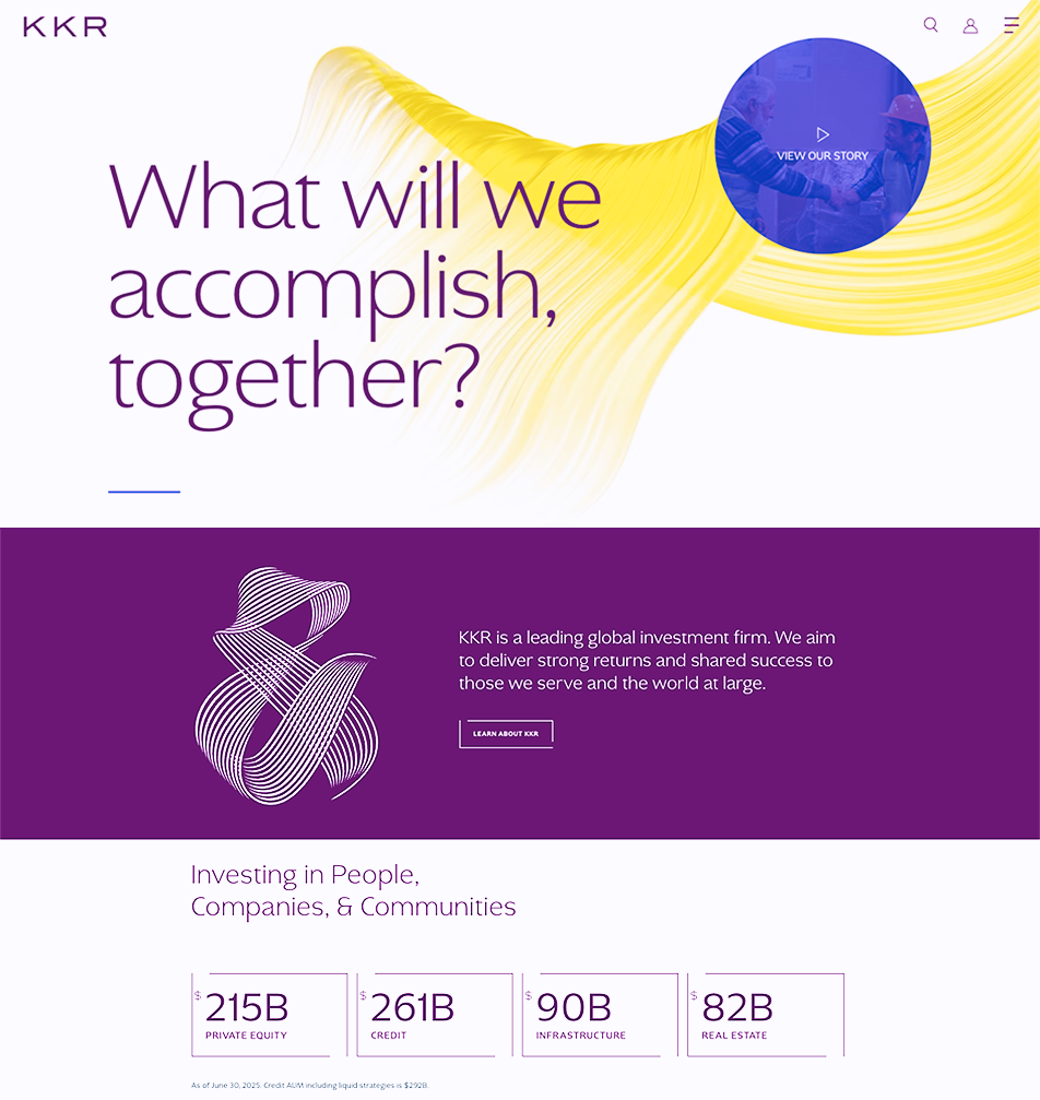
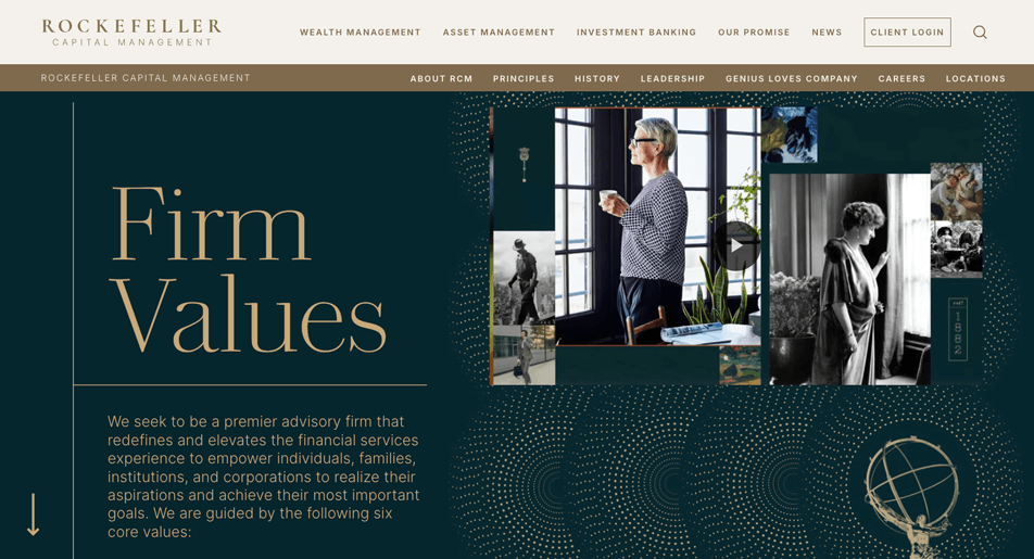
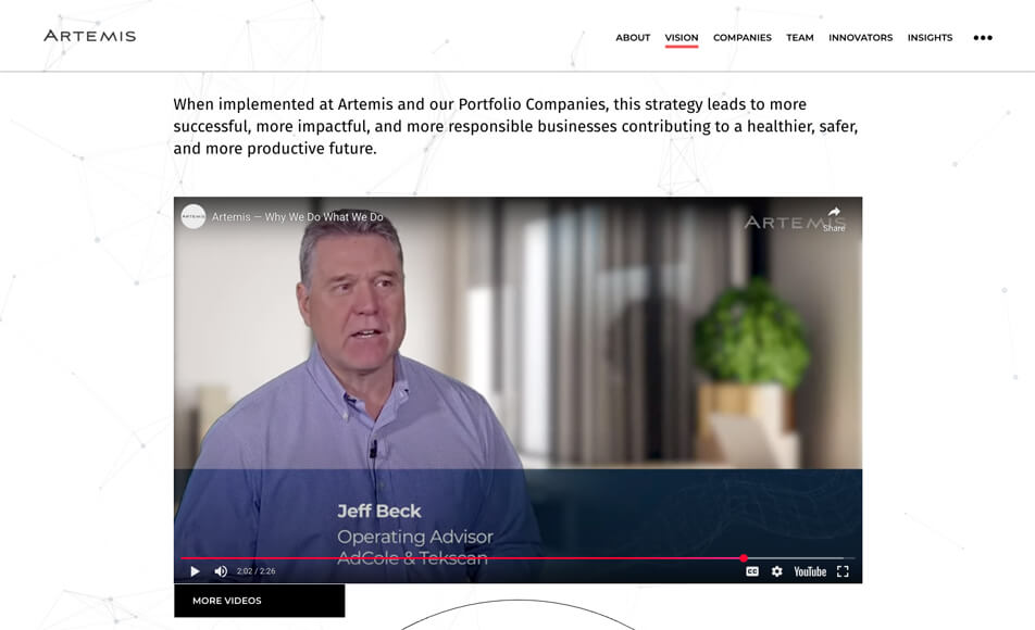
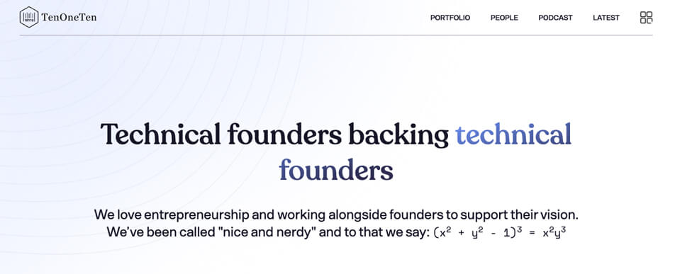
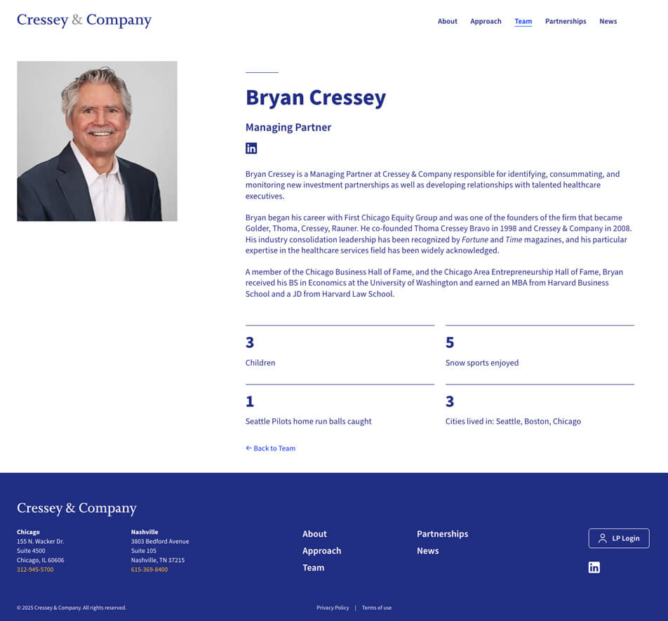
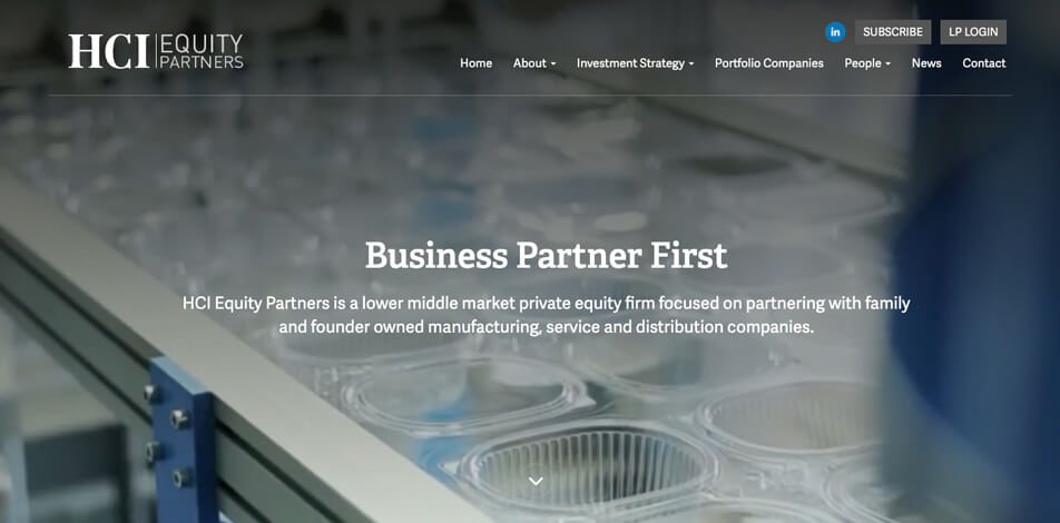
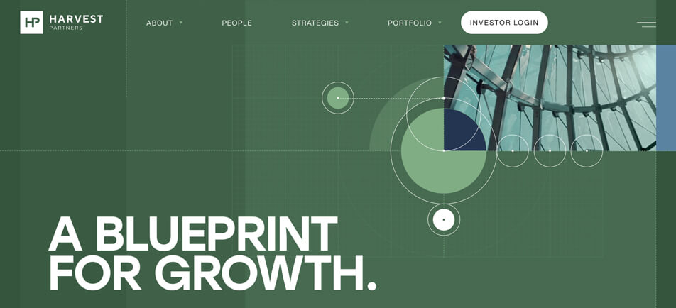
Read on to discover the must-haves for private equity and family office websites—plus, get inspired for your refresh or complete rebuild with 14 examples of sites getting it right.
6 capital management website non-negotiables
No two investment-focused sites are the same. Each has one or more target audiences with nuanced needs, and website persona research findings are often the best way to illuminate them, enabling you to incorporate this information into strategic website planning.
Ultimately, though, everything that goes into those high-performing private equity and family office websites typically aligns directly with all of the stuff that matters most to those who visit capital management sites.
At a glance, these must-haves include:
- Clear investment criteria
- Role-specific pathways
- Portfolio/holdings rundown
- Social proof with specifics
- Differentiator details
- Low-exposure contact options
Or, put more simply, the very best private equity and family office websites are strategic, providing a white-glove experience online just as they would in person.
These sites don’t require visitors to click all over to access key information. They make it easy to get answers, whether you’re scanning for quick takeaways or diving deep for specifics. They’re inviting, helpful, engaging, and clear. And, they achieve these things because they get the following six must-haves down pat.
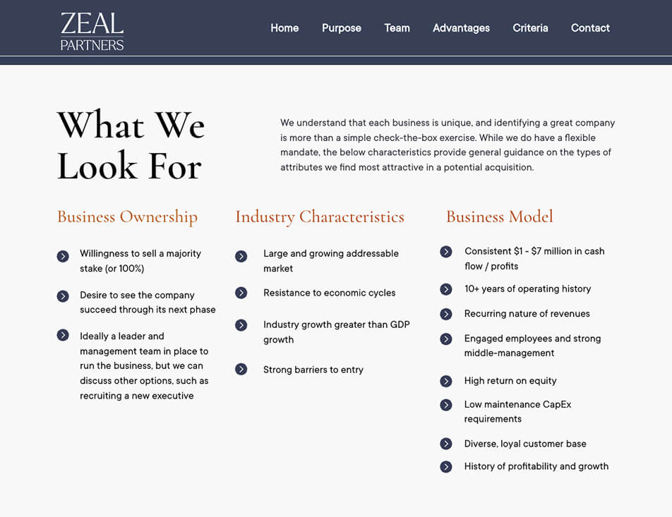
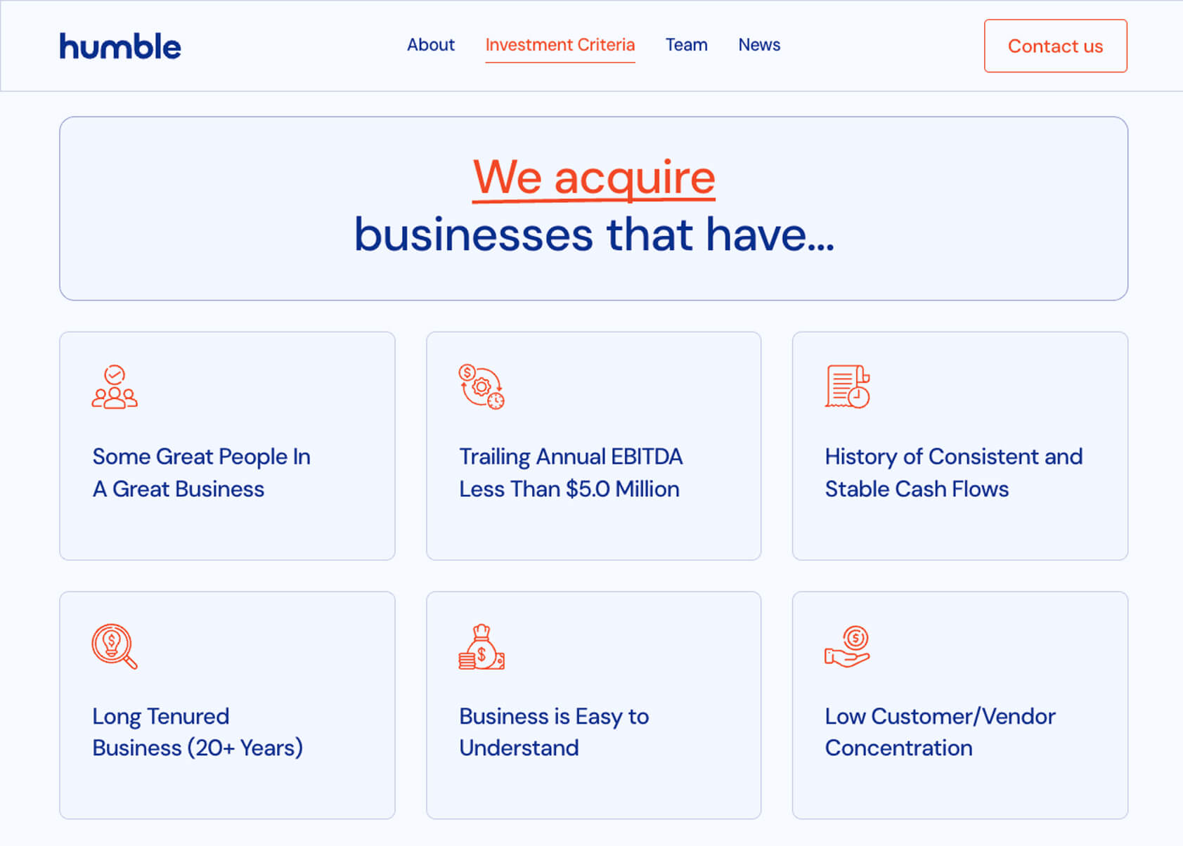
Clear investment criteria
Help visitors confirm alignment fast. Provide a link to investment criteria basics (e.g., stage, sectors, geography, ownership preference, hold range, and check size) in a prominent spot in your navigation. Then, once they’re on your page covering investment criteria, minimize guesswork by using succinct section labels, writing tight copy, and breaking out lists with easy-to-scan bullets.
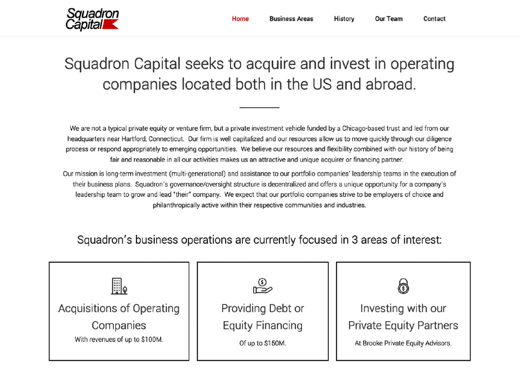
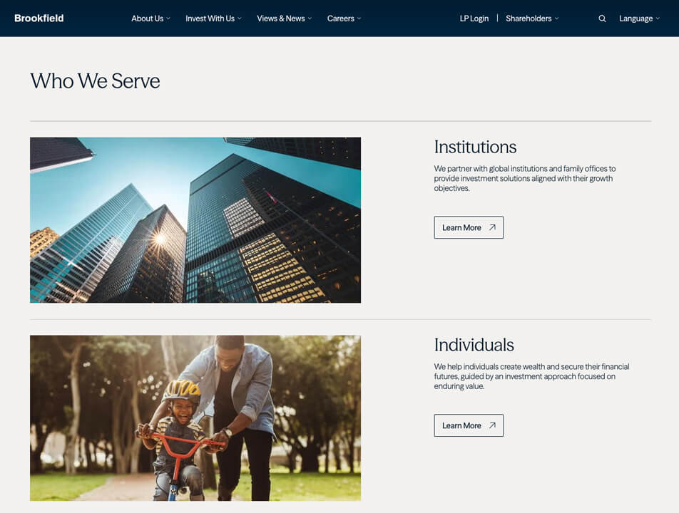
Role-specific pathways
Optimize your homepage so each target audience can quickly find what they need. Create a path for founders to see investment criteria and process specifics. Add a simple way for co-investors to review the portfolio and track record. Provide lenders and advisors with a direct line to “about” information and leadership team contacts.
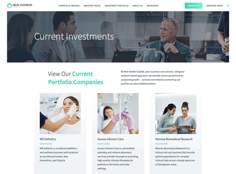
Portfolio/holdings rundown
If your holdings are currently just a webpage featuring a wall of logos and no additional details, it’s time to spruce things up and add more value for users.
Enhance your portfolio presentation by including information on each company, such as its sector/industry, size, location (including headquarters), and partnership duration (e.g., “since [year]”). Bonus points if you also take the time to add a brief sentence on the value story for each holding or create filters to help users navigate long holdings pages.

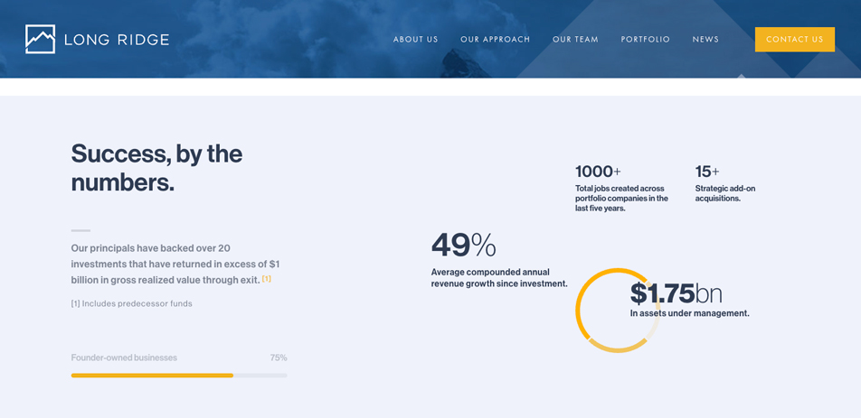
Social proof with specifics
Show results that matter to operators and partners. Pair a single metric with a short quote from someone close to the work. Link to a brief case note when additional context is helpful. Drop the fluff and get specific. Make everything verifiable.
Differentiator details
Generic, jargon-filled, clichéd writing impresses no one. Stand out with storytelling that “explains your edge” using everyday language. Focus your message. Talk about what really matters to your prospects when it comes to partnerships. Share how your group’s support really shows up after a deal closes. Introduce your leaders with short bios that highlight relevant operating experience and board roles.
If a quick organizational timeline or a video origin story clarifies your group’s approach, consider including it where it makes sense.
Low-exposure contact options
Make sensitive outreach feel safe. Offer a discreet introduction form and direct email contact options. Reassure by explaining how confidential materials are kept secure.
Your website should work for you, not against you
Private equity and family office websites should cut guesswork, not add to it. Credible websites shift focus to what users need most. They confirm fit quickly and make it easy to take the next step. If you’re requiring visitors to do things like hunt for the information they need most or wait 40 seconds for each page to load, there’s room for improvement.
Simple changes change outcomes. Even tackling quick wins before launching a complete redesign can improve the results you get from your website.
Close the (website) gaps costing you deals
Since 2004, the web design experts at TBH Creative have been building sophisticated, visually stunning websites that consistently win awards and help companies and organizations reach their digital marketing goals. If you’re ready to revamp your site, our experienced team is here to help. Schedule a free consultation.
Just getting started with your site upgrade? Check out our website redesign planning guide for advice on developing a project budget and vendor selection tips.
Related

About the author Tatum Hindman
Tatum is the president of TBH Creative and is responsible for building long-term client relationships. She enjoys the strategy behind web design and collaborating with clients to define and execute online marketing goals. She likes to blog about hot topics in web design and digital marketing, as well as share tips for strengthening your online presence.
Related articles