2025’s 10 best new Google Fonts typefaces, ranked
With 2026 less than a month away, it seems like everyone is looking back. Movie lovers have begun predicting which flicks will earn Oscar noms. Book critics have started publishing their annual best-of lists. Even bloggers are releasing their posts with end-of-the-year listicles.
In the world of web marketing, many are using what happened over the last 12 months to inform plans for the future, making guesses about everything from which aesthetic trends will impact upcoming design solutions to which hue Pantone will bestow its “color of the year” honorific.
Here at TBH Creative, our team went down a rabbit hole and debated the 10 best new Google Fonts typefaces for 2025. Keep reading to get a visual look at this year’s latest typographic additions to Google’s expansive open-source font library, and find out which of these new options was our favorite.
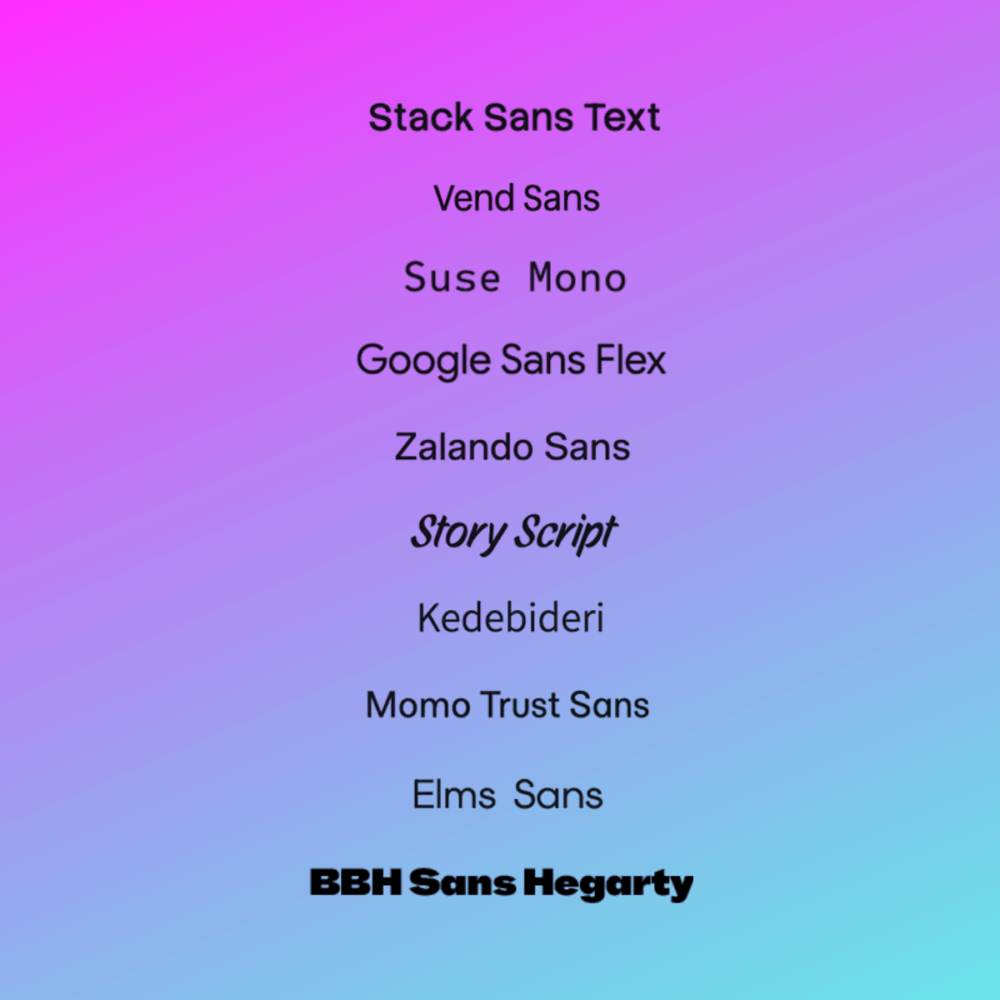
Kedebideri
Date added to Google Fonts: September 12, 2025
If our rankings were based solely on how clever a font is named, Kedebideri, pronounced keh-deh-BIH-deh-rih, would be #1 on our list because of its nearly perfect name (translated into English, it means “Let’s write!”).

Kedebideri is the 24th typeface that SIL International has made available for use via Google Fonts. It’s a contemporary sans-serif that comes in six weights:
- Regular
- Medium
- SemiBold
- Bold
- ExtraBold
- Black
Despite its short duration as one of 2025’s best new Google Fonts typefaces, Kedebideri is already in use on over 2,000 websites.
Stack Sans Text
Date added to Google Fonts: October 3, 2025
Developed for Stack Overflow, Stack Sans Text is a sans-serif font family “rooted in modernist inspiration.” We would have ranked the typeface a bit higher in this roundup if not for its irksome uppercase G and wonky lowercase a.

This 4th typeface* from Koto, released to the public via Google Fonts, includes six weights:
- ExtraLight
- Light
- Regular
- Medium
- SemiBold
- Bold
Despite its recent debut, many web designers have already fallen in love with Stack Sans Text. The proof is that it’s already featured in more than 2,100 website design solutions.
*Note: We didn’t forget about the Stack Sans variations (Notch and Headline). Those came out the same time as Text, but we’ve ranked the latter since it’s our fave from the Stack Sans family.
Momo Trust Sans
Date added to Google Fonts: April 16, 2025
Designed in 2024 for the Vietnamese e-wallet app MoMo, Momo Trust Sans might be the friendliest-looking specimen on our list of new Google Fonts typefaces.

Momo Trust Sans has nine weights:
- Thin
- ExtraLight
- Light
- Regular
- Medium
- SemiBold
- Bold
- ExtraBold
- Black
Despite its strong personality, this modern typeface also manages to be sleek and elegant, looking great paired with its sister fonts—Momo Trust Display (a bolder variation) for attention-grabbing headlines and Momo Signature (a script-y option) for playful accents. This system’s three custom typefaces are the only Type Associates-created selections included in the Google Fonts library.
Momo Trust Sans is featured in more than 2,100 websites.
Elms Sans
Date added to Google Fonts: May 28, 2025
A self-proclaimed “utilitarian geometric sans-serif design for clarity, consistency, and long-term adaptability,” Elms Sans is a versatile typeface with a clean, rounded design similar to fonts like Gotham and Proxima Nova.

Although we deducted points for its readability issues when used for webpage body copy, Elms Sans’ potential for distinctive, attractive website headings and typographic branding applications is indisputable.
This is the only option in the Google Fonts library designed by Amarachi Nwauwa. It includes nine weights (including matching italics for each style):
- Thin
- ExtraLight
- Light
- Regular
- Medium
- SemiBold
- Bold
- ExtraBold
- Black
So far, web designers have included Elms Sans in more than 2,100 websites.
BBH Sans Hegarty
Date added to Google Fonts: Although officially added on October 7, 2025, the typeface—at the time of this writing—is no longer available
BBH Sans Hegarty is the “normal” sans-serif typeface within the BBH Sans font family, which also includes Bogle (condensed, all-caps) and Bartle (expanded, also all-caps).

The typography team that created the family—Studio DRAMA—has also provided two other typefaces for inclusion in the Google Fonts library. Hegarty has only one weight (regular).
SUSE Mono
Date added to Google Fonts: September 19, 2025
SUSE Mono is, as its name implies, a monospaced font. That means every character has the same width. The original SUSE typeface became an option in Google Fonts last year.

This variation has eight weights (including matching italics for each style):
- Thin
- ExtraLight
- Light
- Regular
- Medium
- SemiBold
- Bold
- ExtraBold
Designed by René Bieder, SUSE Mono’s hybrid look “combines geometric precision with monospaced stability, ensuring a modern and efficient aesthetic,” which is why it’s been a favored choice among web designers since it launched as one of the new Google Fonts typefaces in 2025. The typeface is featured on more than 2,000 websites.
Story Script
Date the specimen was added to Google Fonts: June 4, 2025
If an architect and comics illustrator came together to make a handwriting font, it would probably look just like Story Script.

Lighthearted yet structured, each letterform elegantly mimics the thick brushstrokes of ordered, natural writing. Created by Ben Buysse in collaboration with Lana Roulhac, Story Script has been included in the designs of over 2,100 websites.
Vend Sans
Date the specimen was added to Google Fonts: September 3, 2025
It’s not often that a modern sans-serif successfully combines approachable warmth with clean lines and geometric clarity, but Vend Sans achieves this balance while also having exceptional readability.

This confident grotesque is available with five weights (including matching italics for each style):
- Light
- Regular
- Medium
- SemiBold
- Bold
Vend Sans, which was designed by Baptiste Guesnon of Bloom Type Foundry, has been featured in over 2,100 websites.
Zalando Sans
Date the specimen was added to Google Fonts: August 6, 2025
Zalando Sans is a bold, welcoming typeface “rooted in a sans serif grotesque style that aims to balance clean simplicity with attitude.”

This bold sans-serif has eight weights (including matching italics for each style):
- ExtraLight
- Light
- Regular
- Medium
- SemiBold
- Bold
- ExtraBold
- Black
Designed by KH Type co-founder Jakob Ekelund, Zalando Sans is the anchor of the Zalando font family. Its variants available from Google Fonts—Zalando Sans Expanded and Zalando Sans SemiExpanded—were also released this year.
Zalando Sans’ usage is growing swiftly, and it’s been worked into the design solutions of over 2,300 websites.
Google Sans Flex
Date the specimen was added to Google Fonts: November 18, 2025
Google Sans Flex is “the next generation of Google’s brand typeface.” It’s the 216th typeface that Google has developed and made available through its font repository.

With its carefully designed characters that prioritize accessibility and usability, this incredibly flexible sans-serif specimen features variable axes.
Google Sans Flex has nine (!!!) weights:
- Thin
- ExtraLight
- Light
- Regular
- Medium
- SemiBold
- Bold
- ExtraBold
- Black
Although one of 2025’s most recent typefaces released to the public via the Google Fonts library, Google Sans Flex is gaining popularity. It already appears on more than 2,300 websites.
Honorable mentions that didn’t make our top ten of new Google Fonts typefaces released in 2025 include Manufacturing Consent and Savate, as well as new options from these font families:


About the author Joy Olivia Miller
Joy is the creative director at TBH Creative and uses her expertise to help clients use their online communications to build, design, and manage their brands. She likes to blog about content marketing in all its forms, the latest trends in digital marketing, and share tools with readers.