Designing for the digital fold—myth or must?

The phrase “above the fold” originated from the time of the newspaper (for the younger readers out there, a newspaper is a ream of large, unstapled paper sheets used to convey news and information). In brief, “above the fold” means that publishers and designers ought to put the most important content and calls-to-action above the physical fold line of the page.
But as newspapers go the way of the dinosaur, and news publications move to digital, does this concept still exist? Should important content be placed at the top of the homepage, so users don’t have to scroll to find it? Or are web-surfers unbothered by scrolling, making the digital fold a myth?
A Technical Overview of the Digital Fold
The definition of “above the fold” is the point at which all content on the web page can be viewed immediately, without scrolling.
The idea of designing “above the fold” is based primarily on the “five second rule”– that users pass judgment on the site in loosely five seconds. Another part of it comes from usability researcher Jakob Nielsen’s finding’s that users spend 80% of their time on a website above the digital fold; this suggests that any content users have to scroll to find only gets 20% of the love.
Pretty convincing argument, Jakob Nielsen. But there are two things that have changed since Nielsen made this claim: responsive design, and captivating content.
Debunking the Fold
How screen size impacts the digital fold line
We live in a multi-screen world now, something that wasn’t the case when the idea of “the fold” came about. We are constantly pin-balling around between desktop monitors, and iPhones, and laptops, and tablets. In fact, I’m currently using a double-screen set up with a monitor and a laptop to draft this post! So what does this mean to you? It means there is no one, single fold line. There can’t be! Dimensions change drastically depending on which device you are using. Say it with me: “there is no one, single fold line.” Feel better now?
“90% of mobile users start scrolling within 14 seconds.” –MOVR
Scrolling is habitual now. It started with the smart phone and the idea of a “feed”, and since then we have become more and more accustomed to scrolling… and scrolling… and scrolling…
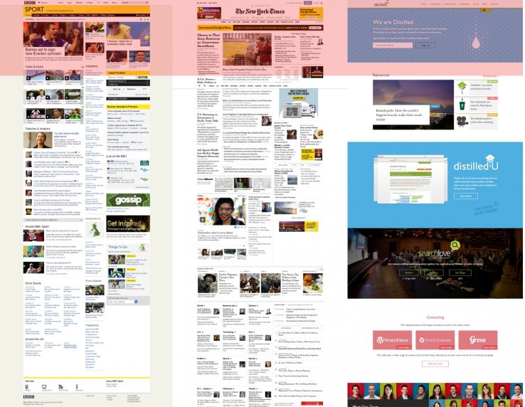
Web designers are no longer hard coding for a specific pixel number that relates to a fold line. Instead, web designers are weaving in responsiveness so that sites adapt to any screen size. At TBH, we build for responsiveness in every project we do. Here are a few images from our recent redesign project for One View. Their website was constructed to respond to laptops, tablet, and mobile phones.
How scrolling impacts the digital fold line
Another nail in the fold’s proverbial coffin is content. As we mentioned in a recent blog post about popular website design trends of this year, animation on a web page is a growing design trend. A lot of this animation is actually triggered by scrolling. In fact, we’re starting to see scrolling itself become eye-catching design feature.
The Digital Fold Myth Busted
In general, we urge our clients not to worry about the digital fold. Users are so used to scrolling now, and there are many cool design features you can build around scrolling, there is no reason to fear the fold.
However, this is not to say you shouldn’t consider what you put at the top– you wouldn’t have your navigation bar along the bottom and your copyright statement running across the top. It is a good rule of thumb to put something meaningful at the top of each page, but you don’t need to cram in everything.
It all comes back to content: what you are saying, and how you are saying it. If you build your site around content and message, and do it correctly, it’s going to drive users to all corners of your website.

About the author TBH Creative
TBH Creative is an award-winning marketing company specializing in web design/development, digital strategy, inbound marketing, and reporting. Since 2004, we’ve built multi-dimensional digital marketing campaigns and complex, enterprise-level websites for clients in a wide range of industries.
We believe in communicating clearly, delivering excellence, and beating deadlines. But beyond those ideals, what really drives the heart of our business is your business—helping our clients achieve more with comprehensive digital marketing and web design.
Related articles