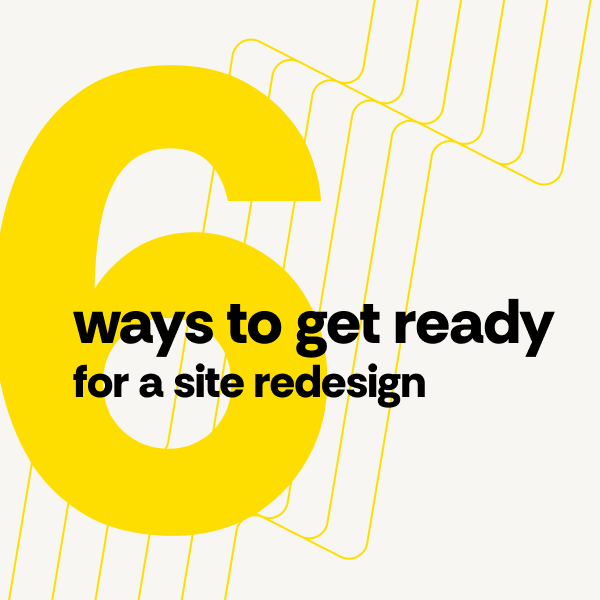
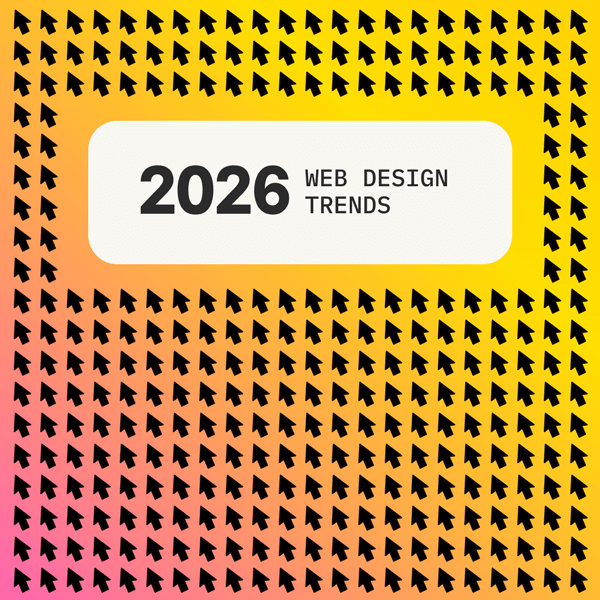
Get redesign inspiration from these eye-catching 2026 web design trends
Your website is often the first impression potential customers have of your brand. If it feels outdated, you might be losing them before they even read your homepage. The good news? 2026 is shaping up to be an exciting year for web design, with fresh approaches that can help your site feel more human, more engaging, and more effective at converting visitors.
Whether you’re already planning a redesign or just wondering if your current site could use a refresh, understanding what’s ahead in 2026 web design trends can help you make smarter decisions about where to invest your time and budget.
Keep reading to learn which design approaches are gaining momentum, which proven strategies are still worth your attention, and which outdated trends you can finally leave behind.
What’s growing in popularity
These emerging trends are appearing more frequently on the Web, and they’re likely to become even more common throughout 2026. What they all have in common is a focus on making websites feel less like static brochures and more like experiences that respond to and respect the people using them.
Micro-interactions: Subtle movements with meaning
Micro-interactions—more than decorative movements that serve no purpose—are little moments baked into a website to show it’s reacting to what you’re doing while navigating its content.
It might be a button that gently shifts when you hover over it or a form that shakes slightly when you’ve missed a required field. Sometimes, small movements are designed to encourage further user engagement and exploration, guiding people through a site in ways that make these interactions feel natural and responsive.
When done right, they’re barely noticeable yet make the site feel helpful because the movement adds polish and refinement to the user experience.
Deeper inclusivity: Solutions balancing empathy and accessibility
This goes beyond just meeting basic accessibility standards. More designers are thinking about the full range of ways people might interact with a website. Whether they’re using a screen reader, have color vision differences, struggle with small text, or just get overwhelmed by busy layouts.
The goal is creating experiences that work well for everyone, not as an afterthought but as a core part of the design from the start.
More grit, less rigidity: Warmth through aesthetic imperfections
Perfect grids and flawless layouts are giving way to designs that feel a bit more handmade and human. You might see slightly irregular spacing, hand-drawn elements, or textures that look like real paper or fabric. It’s not about being messy. It’s about creating visual warmth that makes your brand feel more approachable and less corporate. People respond better to websites that feel like they were made by actual humans.
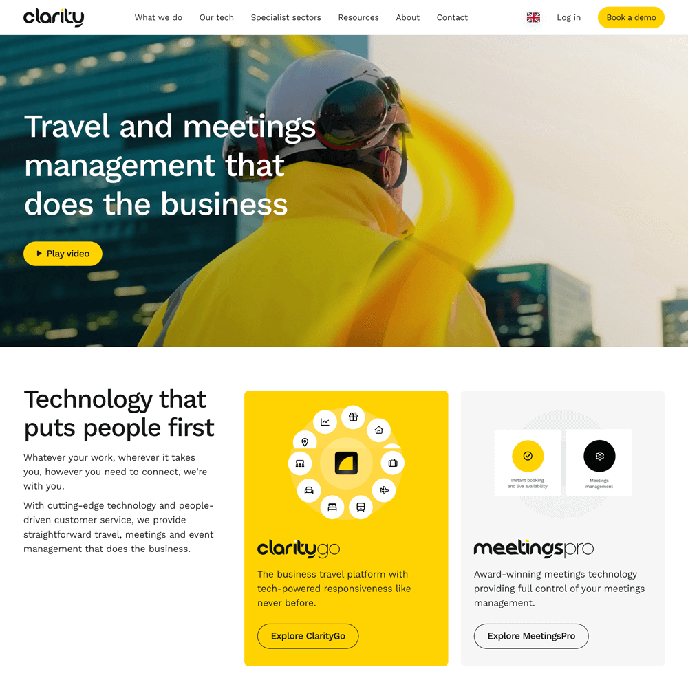
Bespoke UX design: Uber-personalized, captivating web journeys
Websites are getting smarter about showing different people different things based on what they actually need. Instead of everyone seeing the exact same homepage, your site might highlight different products, content, or paths based on whether someone’s a first-time visitor or a returning customer, their industry, or what they’ve shown interest in before. It’s like having a good salesperson who remembers what you talked about last time.
What’s still hot
Some trends from 2025 proved their value and aren’t going anywhere. These approaches have stuck around because they genuinely improve how websites perform and how people experience them.
Mobile-centric: Sustainable, accelerated, and lightweight
Phones haven’t been an afterthought in web design for quite some time, but not all designers have prioritized it. Today, many designers start with the mobile version first and work up from there. This means faster loading times, simpler navigation, and cutting anything that doesn’t earn its place on the page or enhance the user experience.
With most website traffic coming from phones, this isn’t really a trend as much as it’s just how things need to be built now.
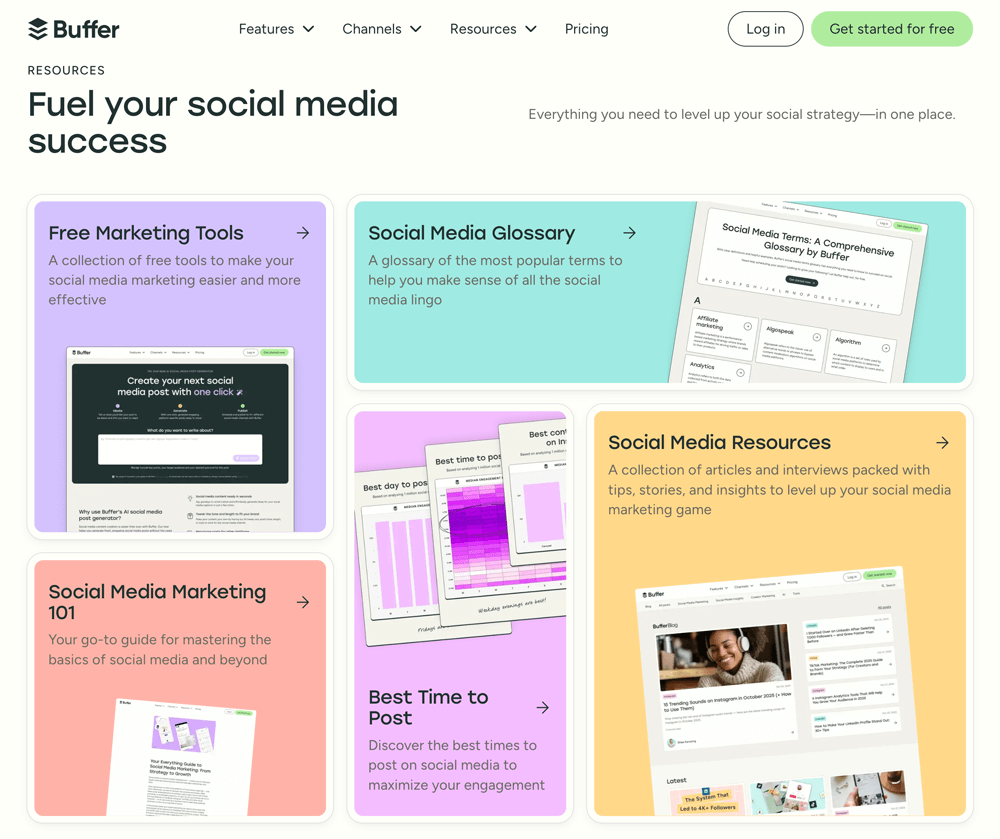
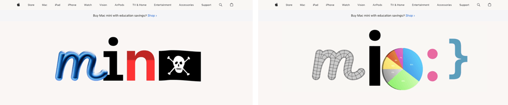
Maximalism: Complex typography and layered collage compositions
Not every website needs to look like an Apple product page. There’s been a resurgence of bold, expressive design with overlapping images, eye-catching type, and rich visual layers that command attention. It’s particularly popular with brands that want to stand out in crowded markets or appeal to younger audiences. The key is having a clear hierarchy, so all that visual energy doesn’t become overwhelming chaos.
What’s on its way out
These approaches had their moment, but they’re starting to feel tired. If your current website relies heavily on these elements, a refresh might be worth considering.
Sterile, overly minimalist layouts
There’s a difference between clean design and design that feels cold and empty. The ultra-minimal aesthetic (lots of white space, barely any personality, everything perfectly aligned) worked for a while, but now often reads as generic or uninviting. People want websites that feel like they have some life to them, not like they’re walking through an empty showroom.
Basic stock photos and generic AI art
Those polished stock photos of people in business casual having laptop meetings or shaking hands? Everyone’s seen them a million times, and they scream “template.” Similarly, AI-generated images that have that telltale smooth, uncanny look are already starting to feel stale. People connect with authentic visuals—real photos of your actual team, products, or work—even if they’re not technically perfect.
What actually matters for your 2026 website project
Website design trends are helpful guides, but they shouldn’t dictate your entire strategy. The sites that perform best in 2026 won’t be the ones that check every trending box—they’ll be the ones that understand their audience well enough to know which trends actually serve their goals.
A micro-interaction might delight users on an e-commerce site but feel out of place on a professional services page. Maximalist typography could make a creative agency stand out, but confuse visitors to a healthcare portal. The real skill is knowing what fits your brand and what your users actually need.
So take what resonates from these trends, skip what doesn’t, and build something that works for the people you’re trying to reach.
Need help with your redesign?
If you’re still struggling to figure out which direction makes sense for your business and need a partner who can translate trends into a website strategy that actually drives results, we can help. Since 2004, TBH Creative’s experienced team has helped clients create websites that look current and convert. Reach out for a free consultation. How can we help you?

About the author Tatum Hindman
Tatum is the president of TBH Creative and is responsible for building long-term client relationships. She enjoys the strategy behind web design and collaborating with clients to define and execute online marketing goals. She likes to blog about hot topics in web design and digital marketing, as well as share tips for strengthening your online presence.
Related articles