Web Design: Mega Drop Down Menu Tips & Examples
Mega drop down menus are becoming very popular and are surprisingly user friendly. Yes, you read that right: user friendly drop down menus. I never thought complicated drop down menus could be user friendly. This is one of the reasons why I love this industry. Professionals are constantly striving to make websites better and easier to use. I have gathered some tips and examples of mega drop down menus below.
Tips
These mega drop down menus are great for menus with more than two levels. When you have more than two levels, the user can get confused and sometimes lost. I have experienced this before on a few websites (coughBed Bath and Beyond). You finally get to the option you want in the 3rd level, slightly move your mouse, and the menu disappears and you have to start from the beginning. This is so frustrating and not to mention, annoying. These mega drop down menus will solve that problem.
There are several different ways to use mega drop down menus:
- organizing pages by section
- organizing blog posts by category/topic
- displaying contact forms or other modules
- extra call to action space
- and more (possibilities are almost endless)
Another important tip is to keep mega drop down menus simple. It can be very easy to get carried away with them. Remember, we are trying to confuse the user less, not more.
Examples
There are several examples of mega drop down menus on the Internet. I picked a few of them to showcase. Each one has a different way of displaying their menu information.
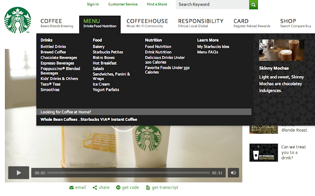
Starbucks Coffee Company uses a mega drop down menu with several CTAs (Call to Actions). They made good use of their space: there is one on the bottom, and two on the right. Great work, Starbucks!
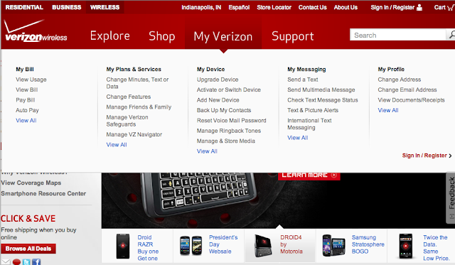
Verizon Wireless uses a very clean and simple approach for their mega drop down menu. It is very clean and organized. They draw attention to the “sign in/register” button for the CTA. They don’t need any graphics to get the user’s attention in this situation.
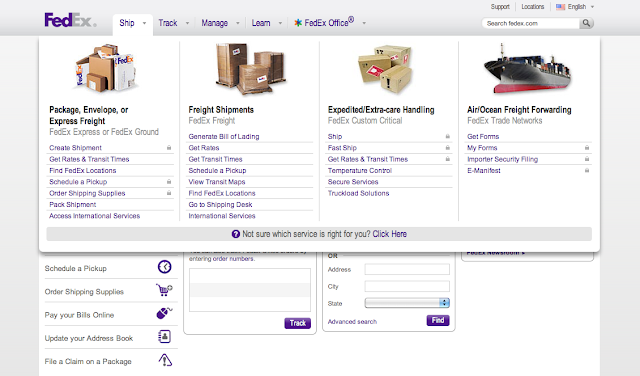
FedEx included beautiful graphics in their mega drop down menu. Their sections are also clear and organized. The graphics also help to break up the text.
TBH Creative Example
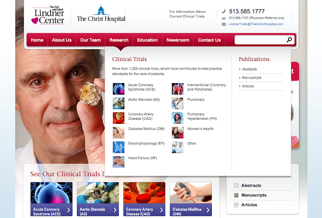
TBH Creative included a mega drop down menu for The Christ Hospital’s The Lindner Research Center research options for clinical trials and publications. Providing up-to-date clinical trial information was the purpose of the website, so we wanted to visually highlight this section and make it very easy to find information quickly.
Do you think a mega drop down menu could improve look and usability of your website? These special drop downs are more organized and easier to read than traditional drop down menus. Contact TBH Creative to schedule a web consultation. We are located in Carmel Indiana near Indianapolis.

About the author TBH Creative
TBH Creative is an award-winning marketing company specializing in web design/development, digital strategy, inbound marketing, and reporting. Since 2004, we’ve built multi-dimensional digital marketing campaigns and complex, enterprise-level websites for clients in a wide range of industries.
We believe in communicating clearly, delivering excellence, and beating deadlines. But beyond those ideals, what really drives the heart of our business is your business—helping our clients achieve more with comprehensive digital marketing and web design.
Related articles